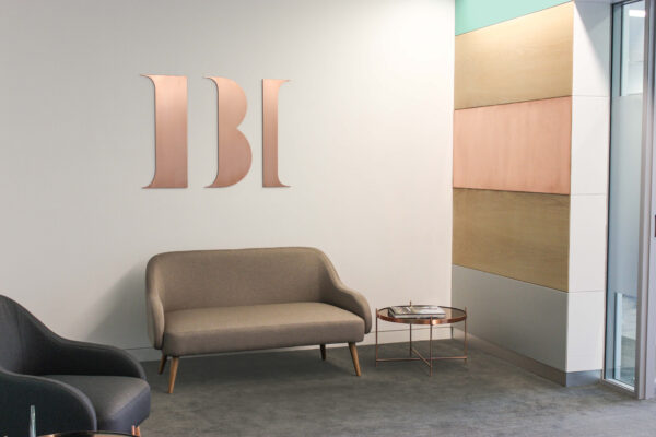
IBI Corporate Finance
A contemporary take on corporate finance
Corporate Services
Corporate Services
Corporate Services
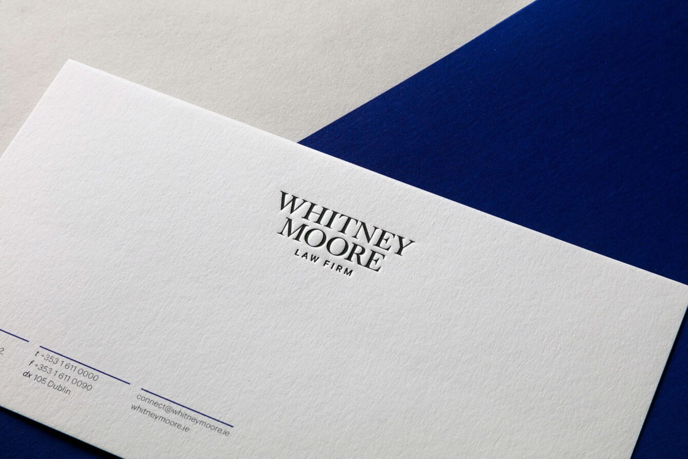
Whitney Moore are one of Ireland’s longest standing law firms, with all the specialist skills and expertise of the big five, they pride themselves on their personable service.

“I will not forget the clients, who were as varied as the human race and without whom the firm would have no reason to exist”
A line from a book titled A Personal History of Whitney Moore & Keller Solicitors from 1882 to 1985.
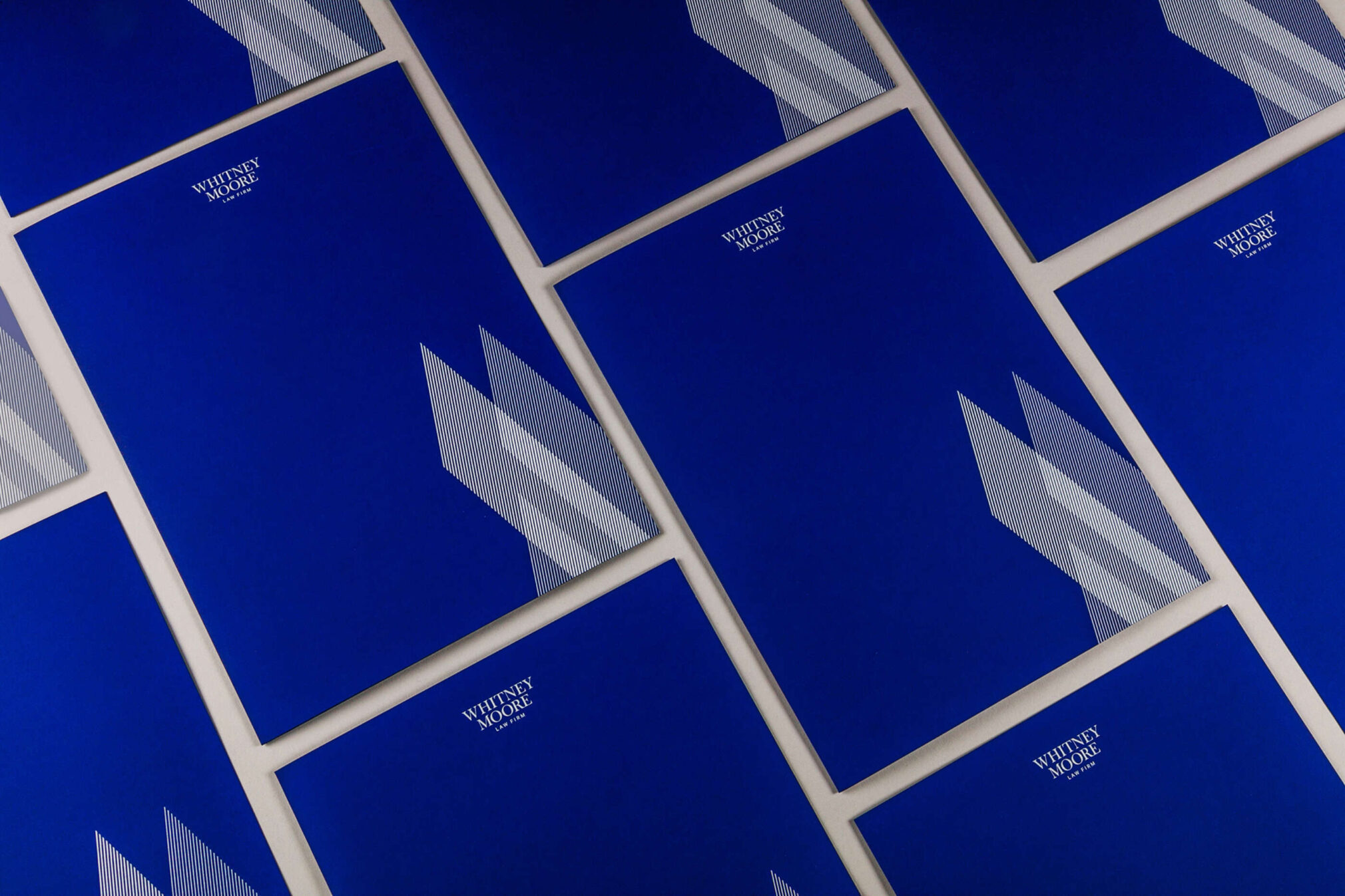
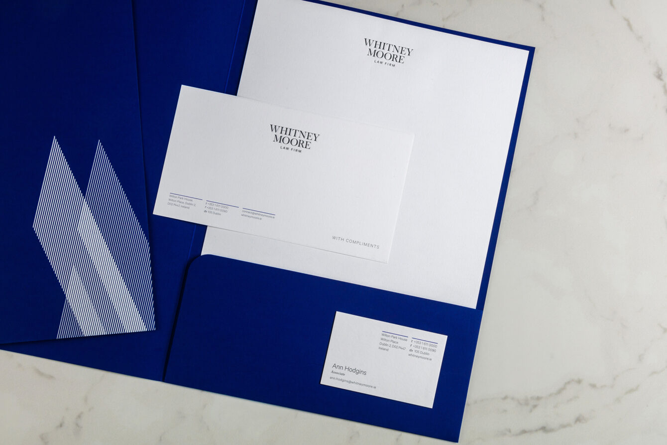
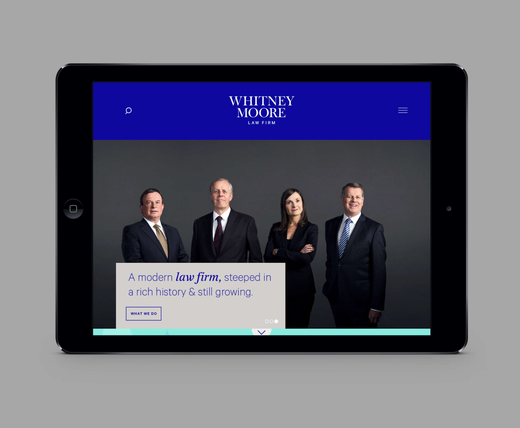
It was clear from the outset that this care and attention they show their clients along with the calibre and ethos of their people are what still differentiates Whitney Moore from other law firms today. We decided to bring this to the fore in the identity through language and commissioned photography of the partners.
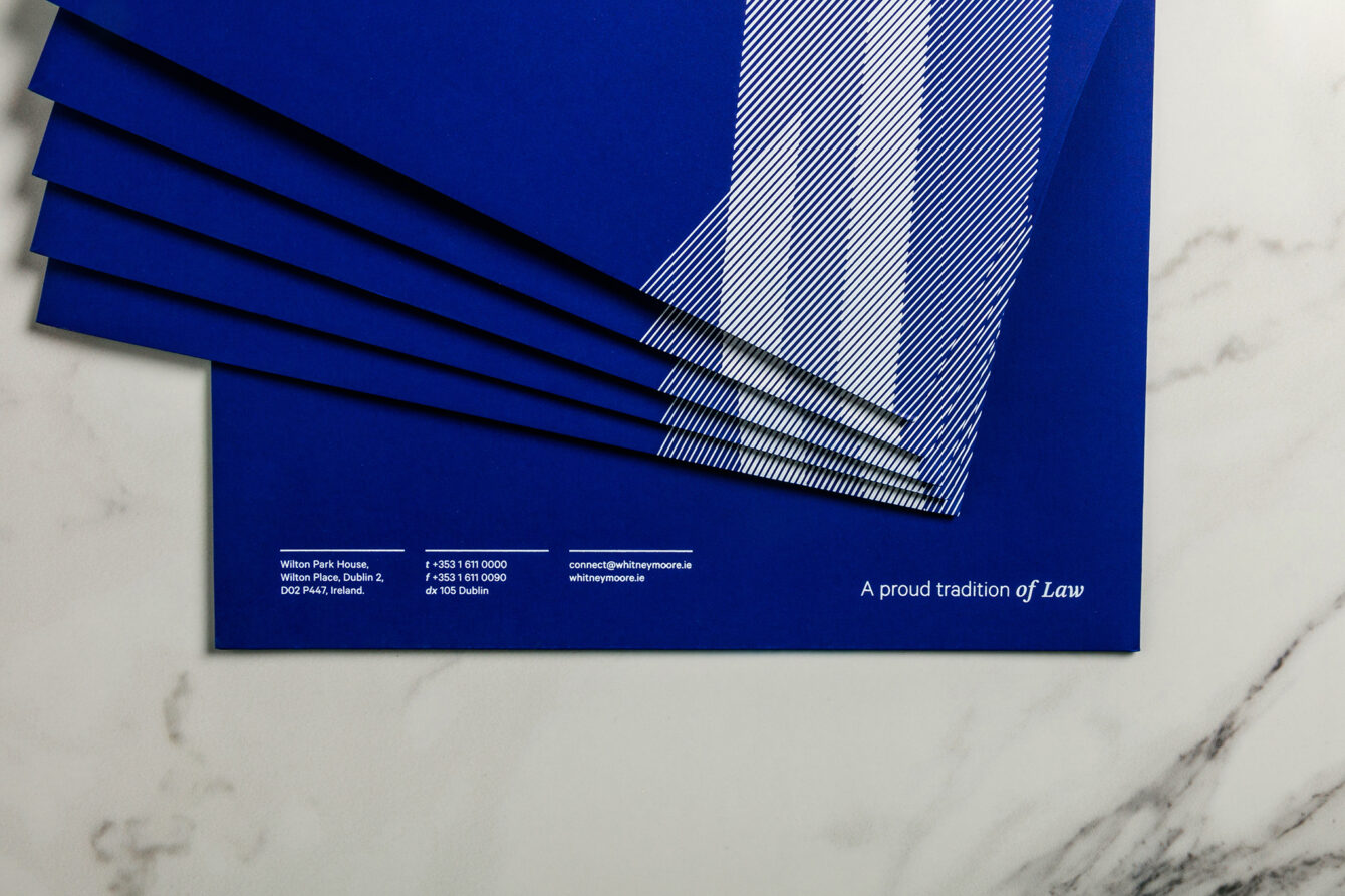
The serif logotype is a nod to the firm’s established history, taking some dynamic graphic shapes from the W & M to create depth and interest, while a fresh and contemporary colour palette reflects a more modern practice. This mix of old and new is further echoed in the choice of fonts selected.
A contemporary take on corporate finance
Corporate Services
The world's largest CTA investment manager
Corporate Services
Architecture for real life
Corporate Services
Reputation innovation consultancy
Corporate Services
The Power of Full Circle
Corporate Services
WE DO brand makeover
Corporate Services