Saba
Iconic Thai eatery
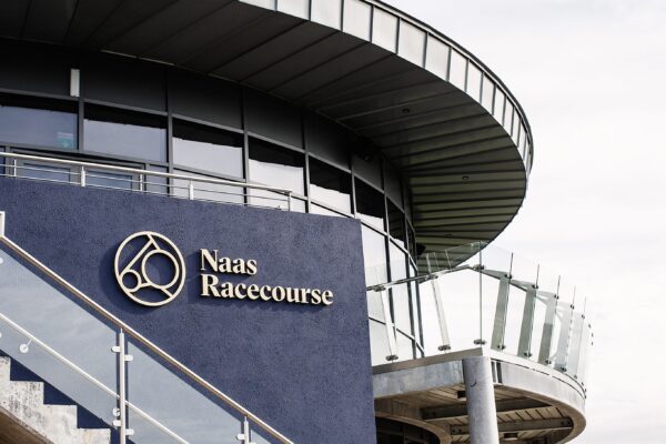
Hospitality
Hospitality
Hospitality
One of Ireland’s oldest and most respected members club, Stephen's Green Hibernian Club needed to broaden its appeal and reach out to a younger audience of professionals living and working in Dublin.
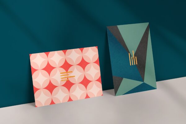
Opening its doors in 1840 as the Stephen's Green Club, a later merger with the Hibernian Services Club becoming the lengthy Stephen's Green Hibernian Club, or SGHC. Following a strategic review in 2018, it was decided to revert to the more manageable name Stephen’s Green Club. A brand refresh was needed to reflect the name change and portray the newer attributes that came The Club wished to convey following the review.
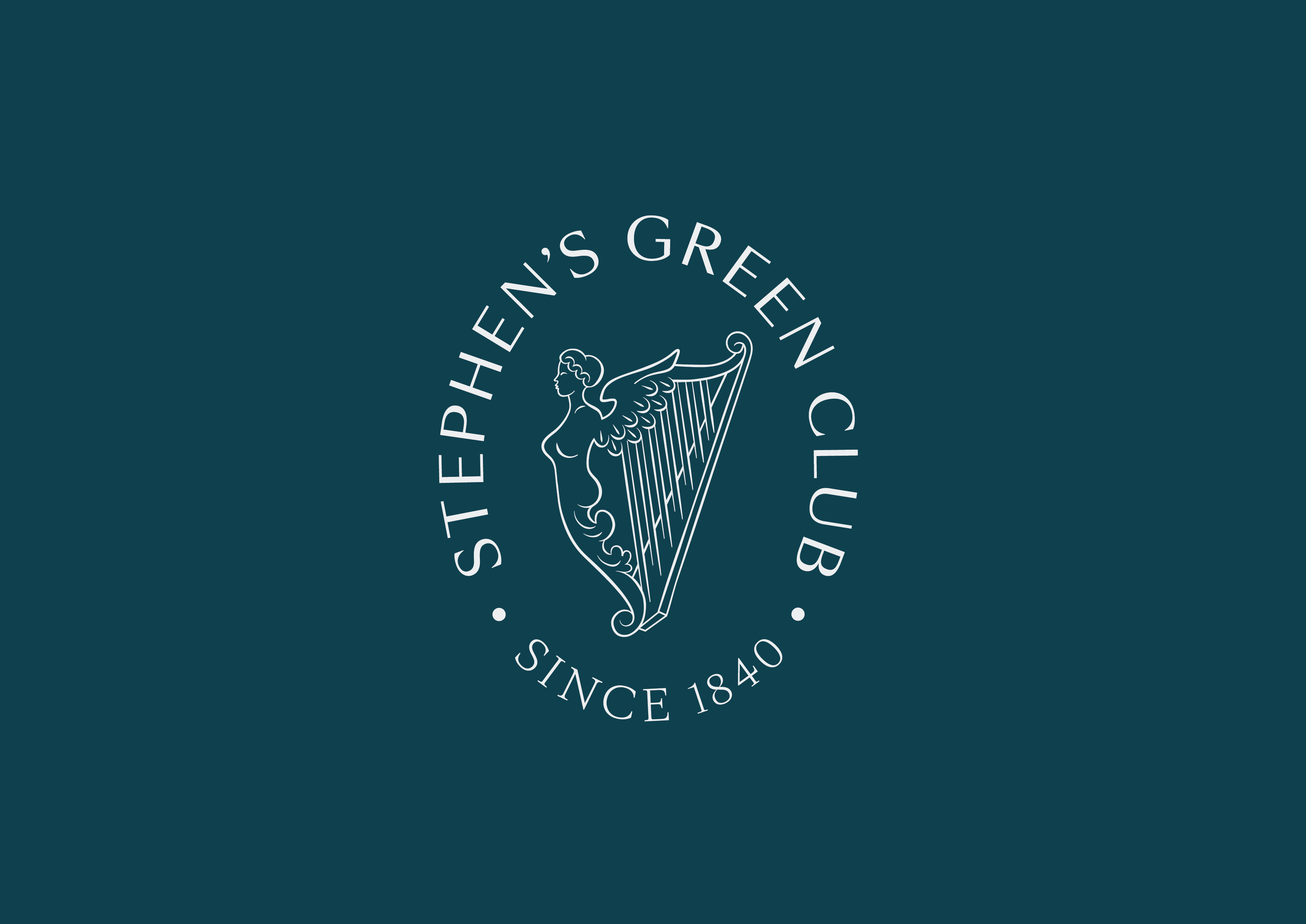
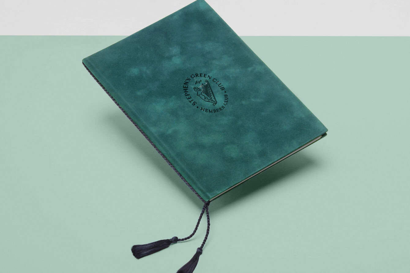
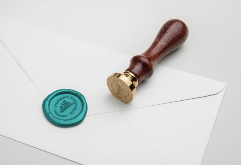
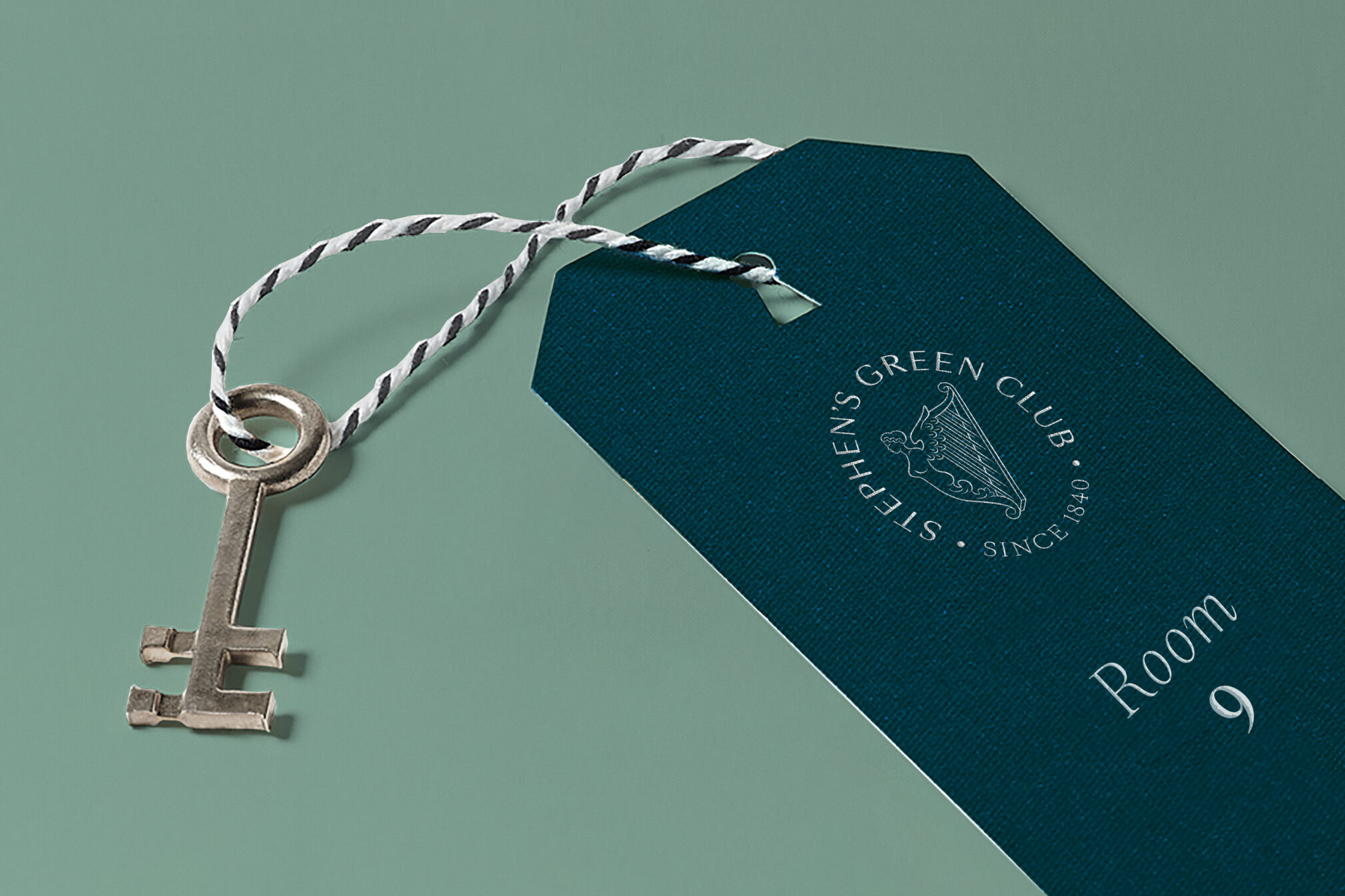
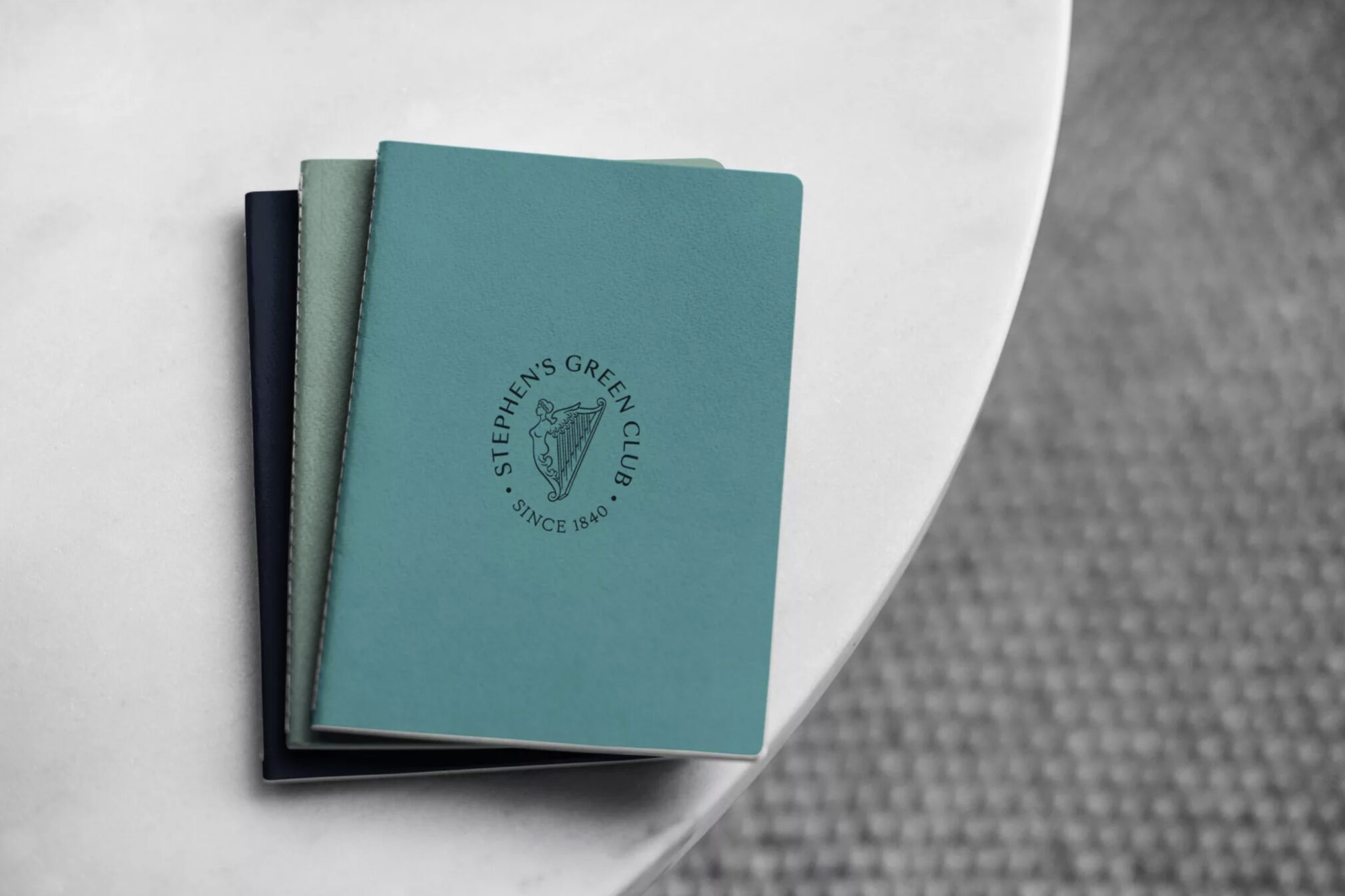
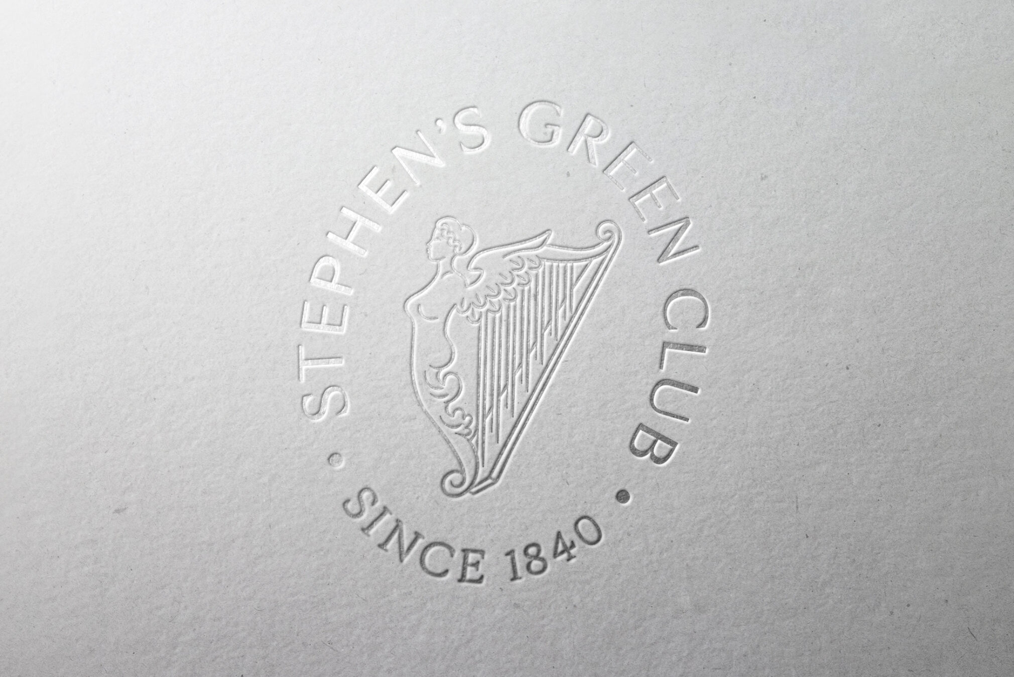
While the word Hibernia was dropped from the name, the figure of Hibernia – the female personification of Ireland - was a very significant element of the existing emblem. It seemed a natural path to bring Hibernia to the fore in a new iteration of the Club’s emblem which was redrawn in-house to create a more elegant and contemporary emblem, with an established feel that captures the rich heritage of the club yet will broaden it's appeal.
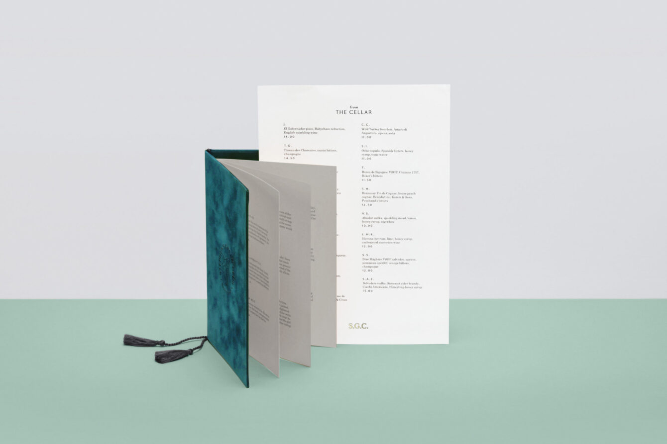
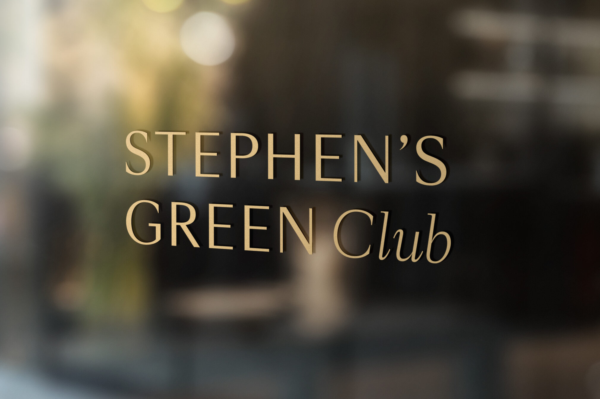
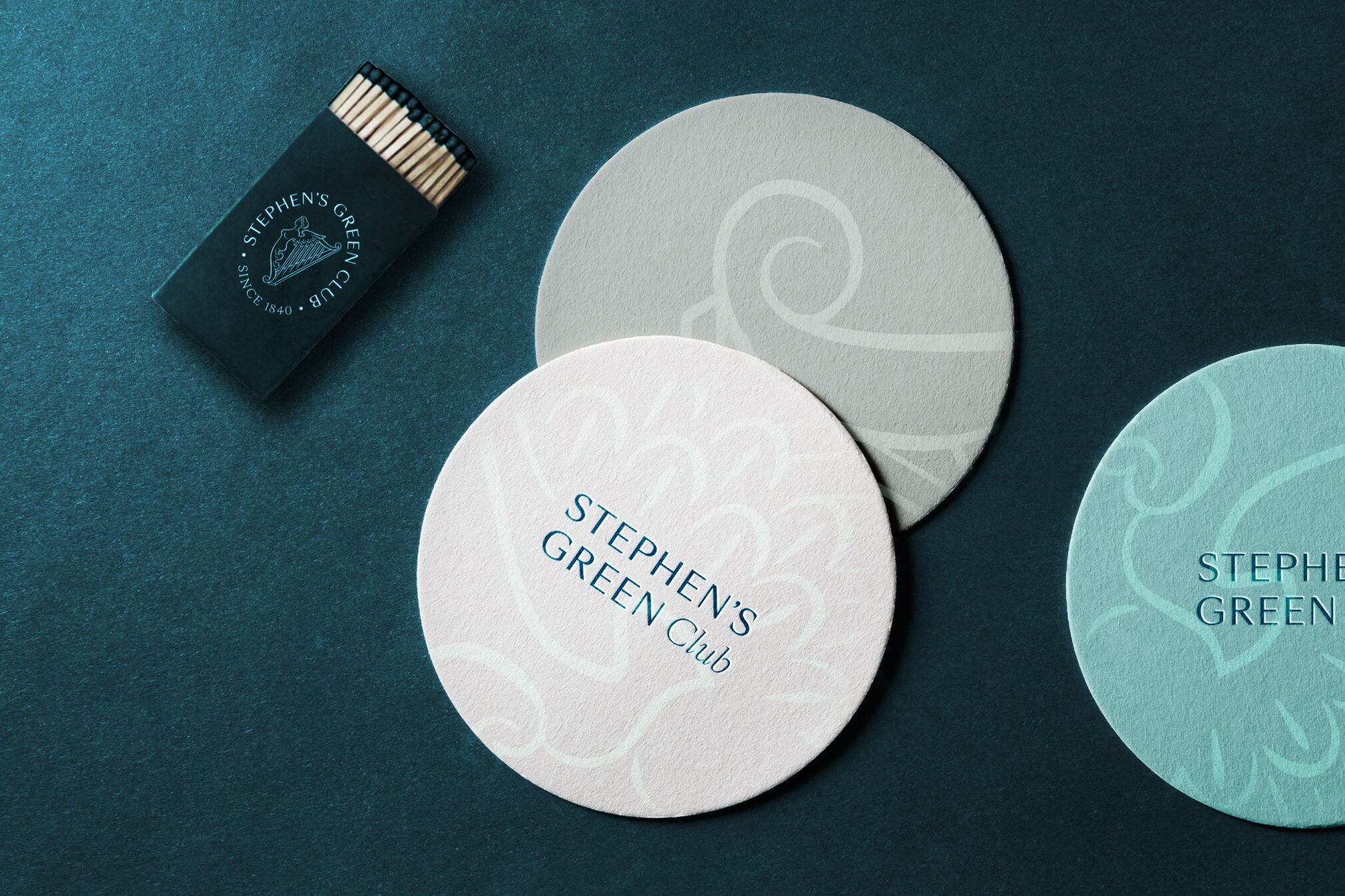
A new type family works across the entire identity, helping to establish a more modern tone, yet it still retains plenty of character. With plenty of weights and styles to choose from, ensuring a flexible system works successfully across multiple channels. Working alongside a refined palette of petrol and sea greens, a mixture of black and white foils, the result is a classic yet timeless tone.
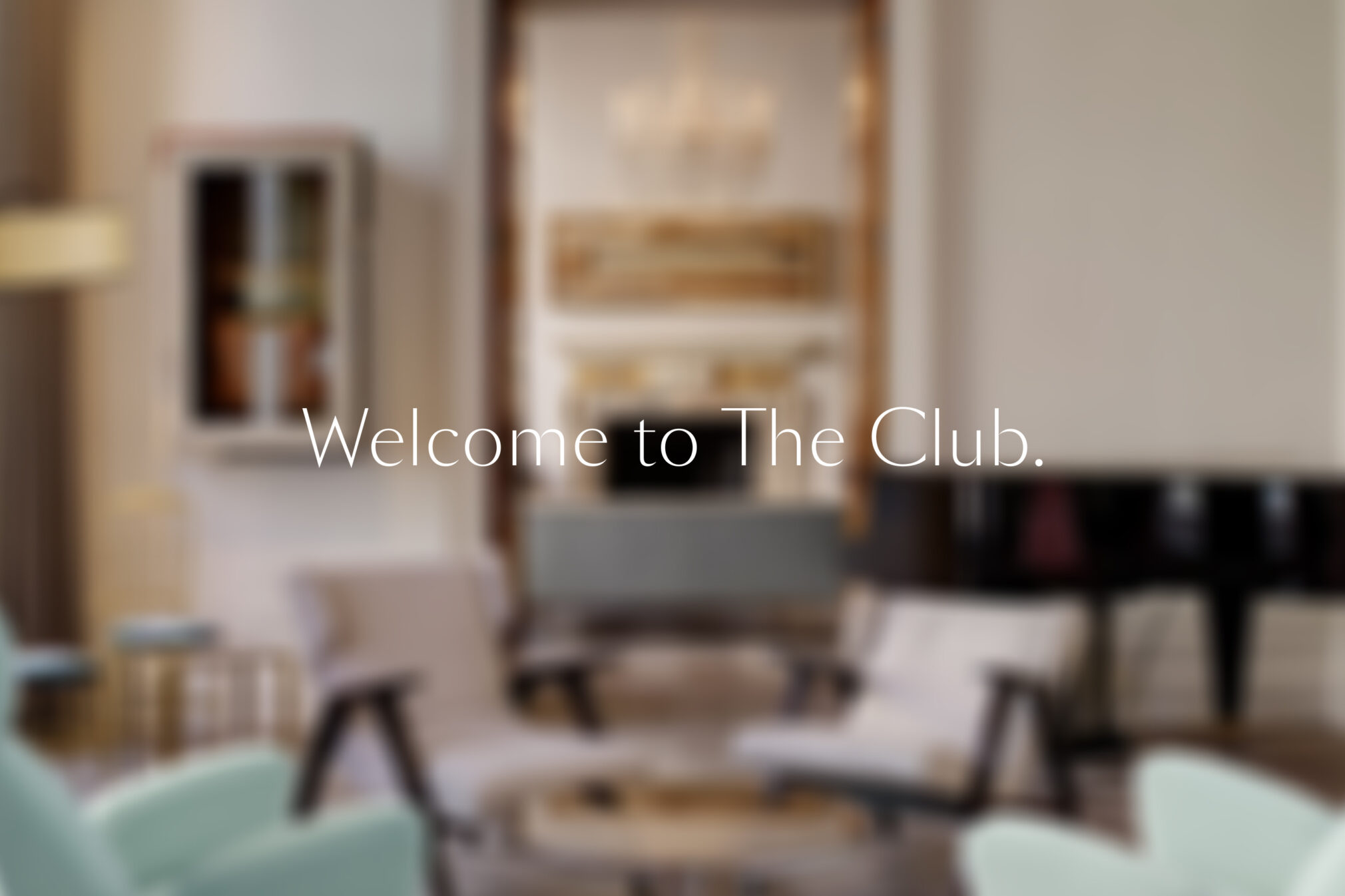
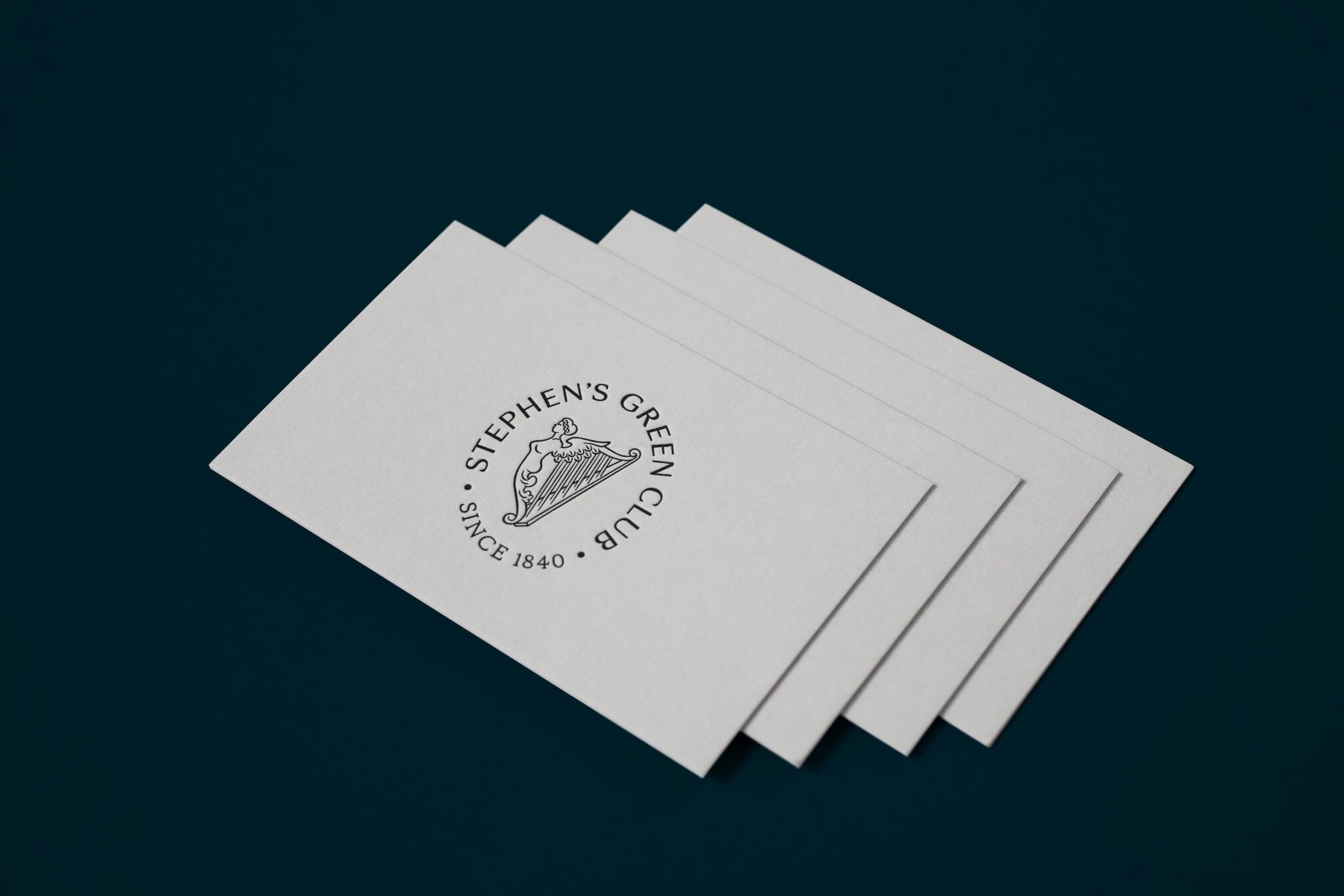
Launched in 2018, the new Hibernia identity including motif and logotype along with their introductory line, Welcome to The Club, were very positively received by all members, existing and new. The identity has been implemented on communications material across all major touch points and channels.