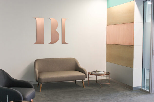
IBI Corporate Finance
A contemporary take on corporate finance
Corporate Services
Corporate Services
Corporate Services
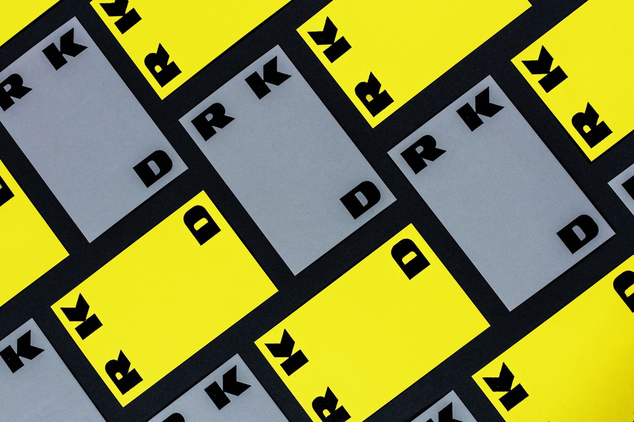
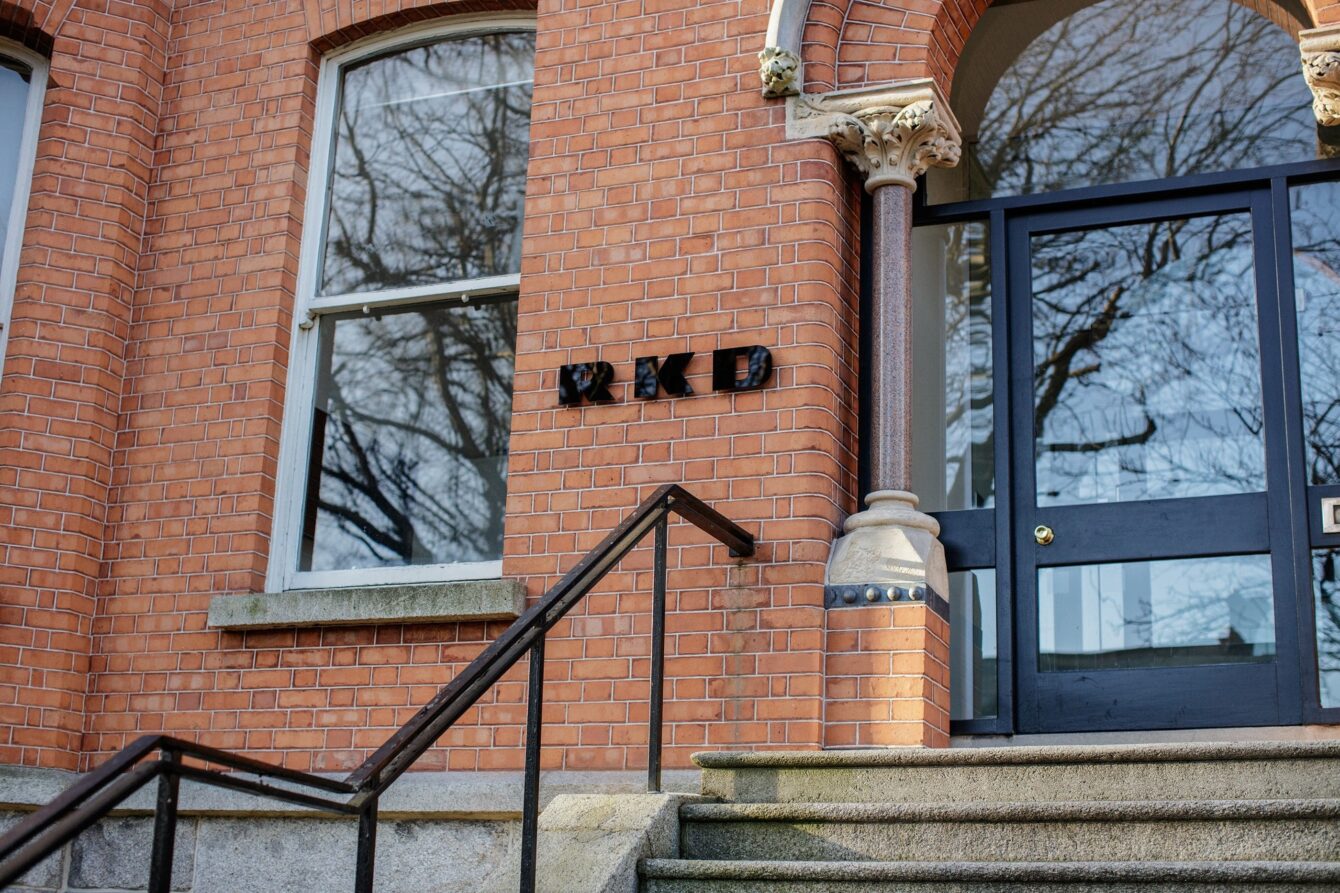
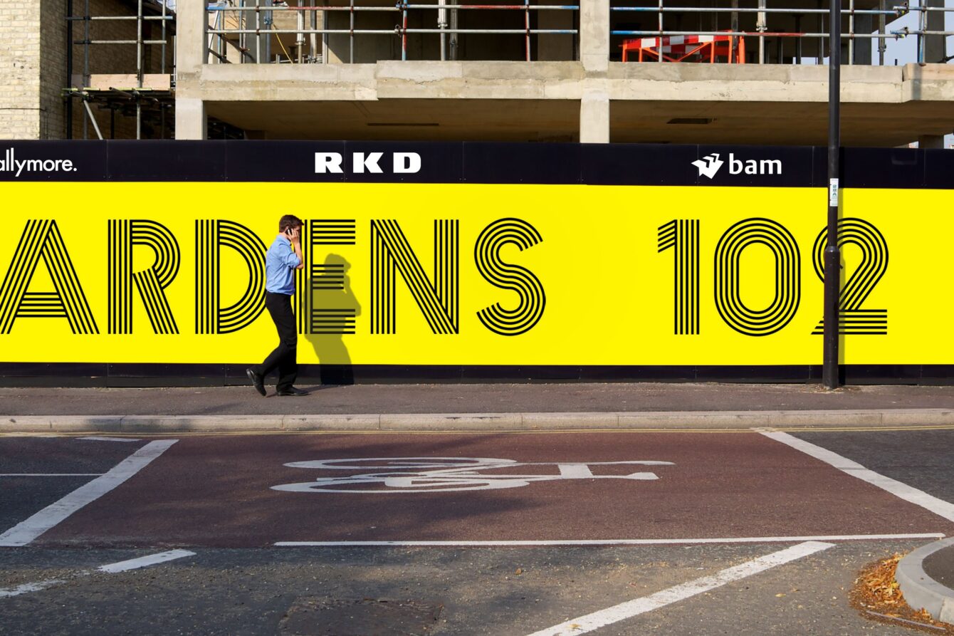
A new identity, custom typography, photography, print communications, video and brand repository for one of Ireland’s largest architecture practices.
A building can appear to change shape depending on the viewers position or aspect. This simple concept informed the development of a distinctive, confident and robust wordmark that works across all platforms at multiple sizes and in different compositions. The logo reacts to space.

Having recently celebrated its 100 year anniversary, CI Studio were tasked with bringing all of the architectural disciplines within RKD (from industrial to interiors) together under one new brand identity system and positioning which unifies and simplifies the organisation and its communications.
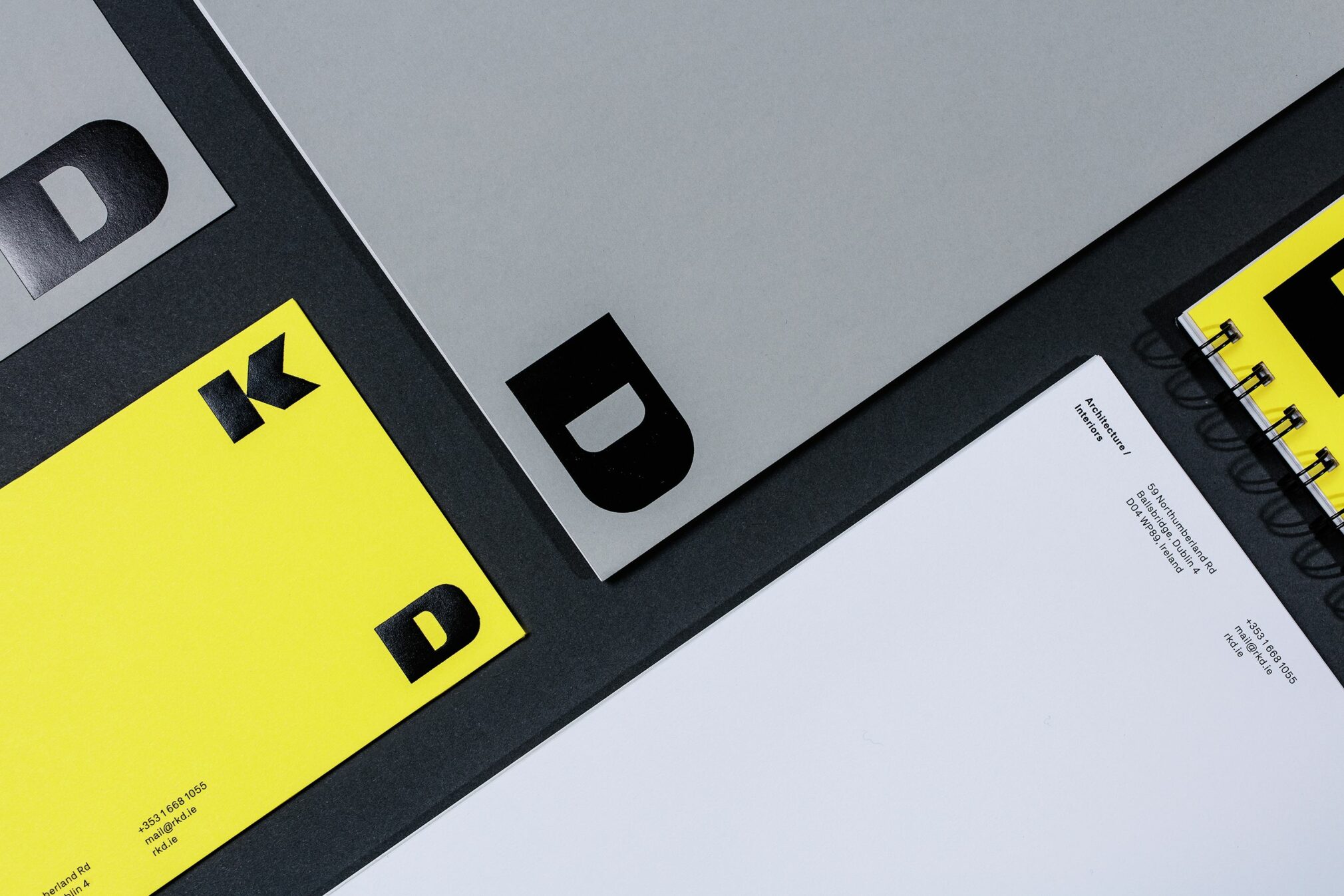
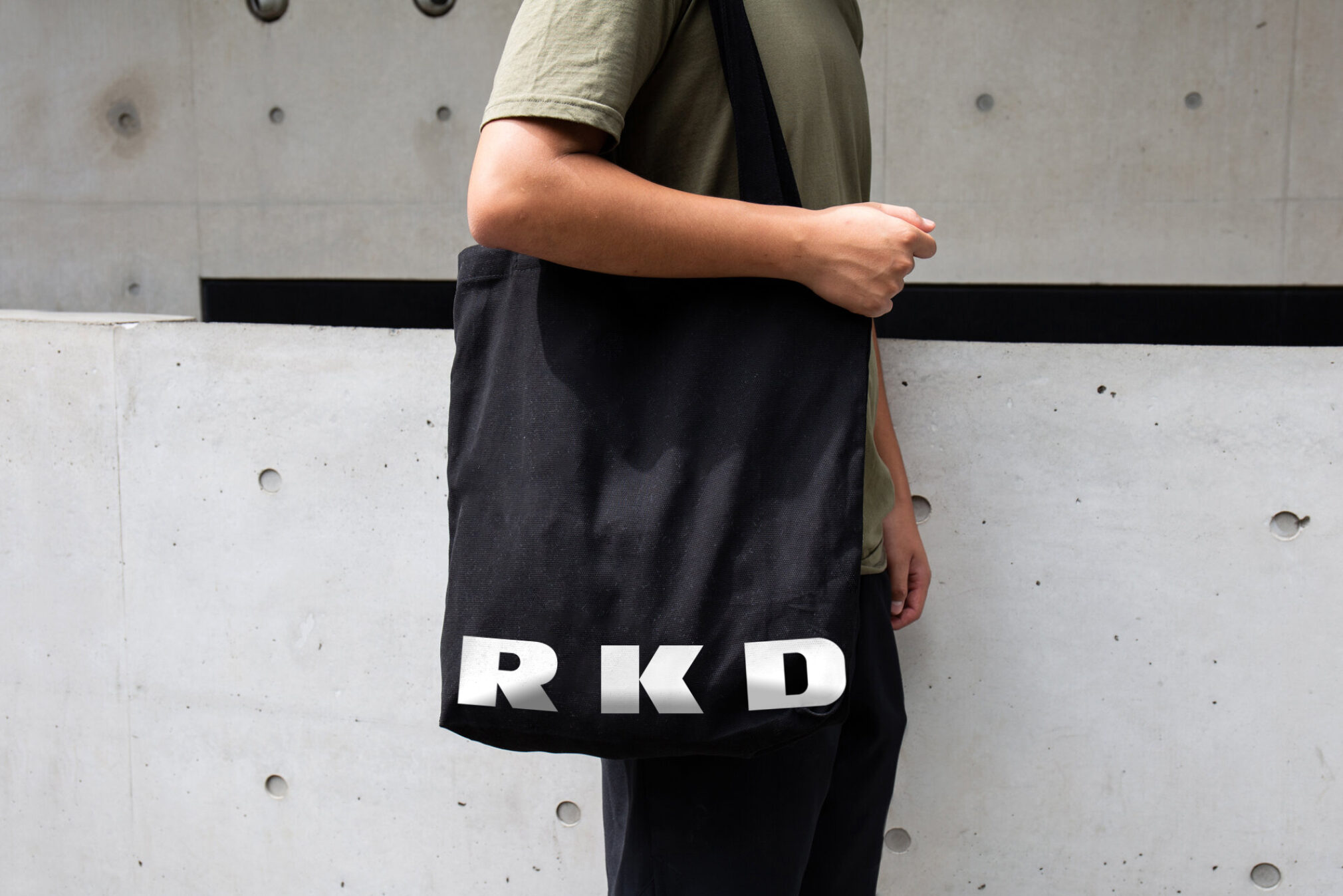
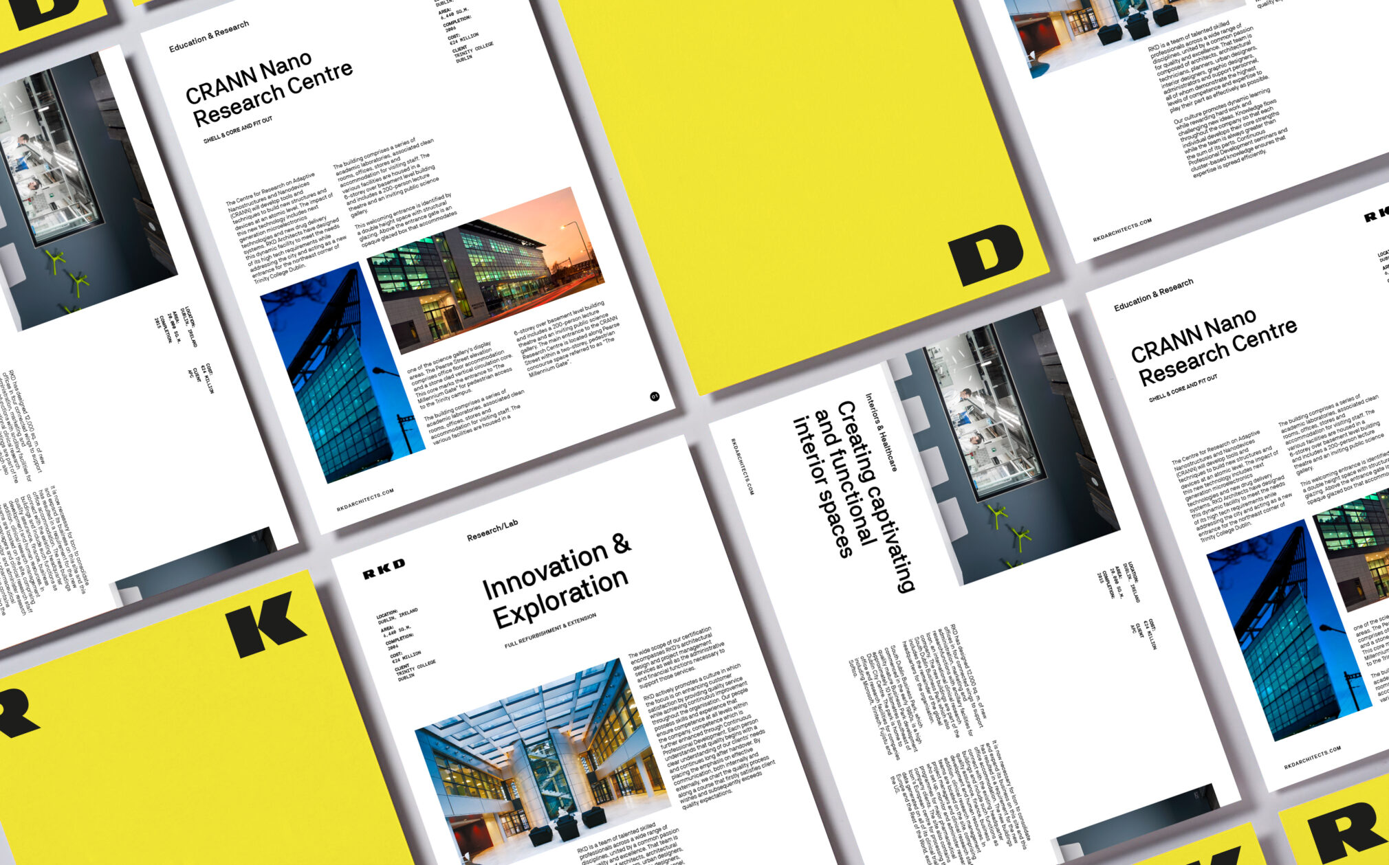
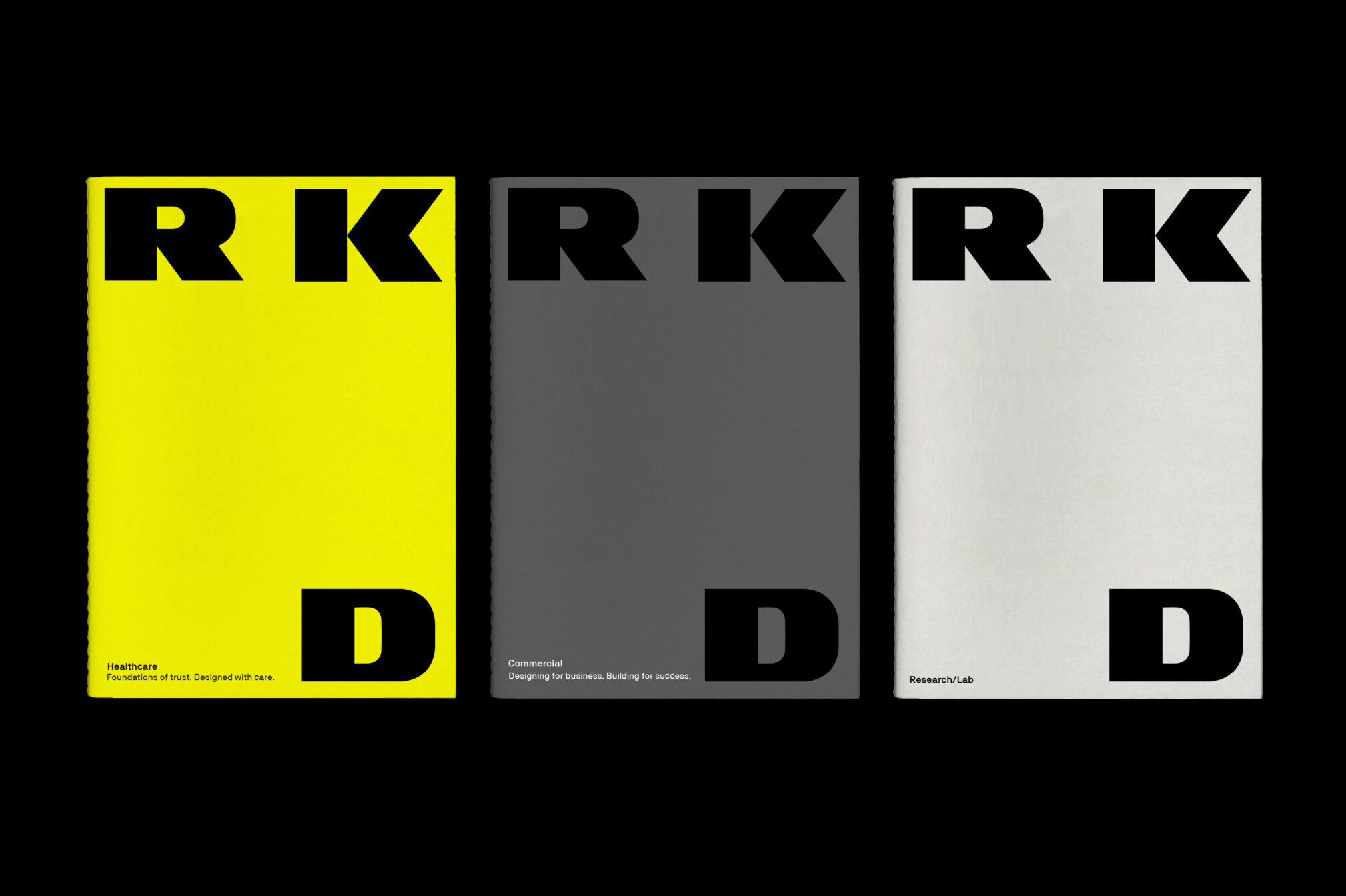
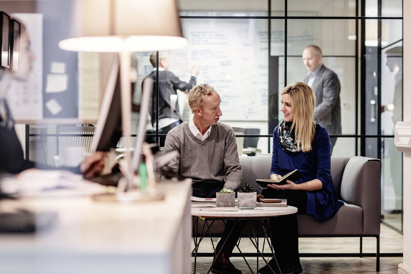
Careful consideration was also given to the choice of typeface, a contemporary grotesque which we crafted with simplicity and abstraction in mind – aptly reflecting the firm’s attention to detail. Photography and video depict warm and functioning spaces and internal collaboration between the people who work there and their clients.
A contemporary take on corporate finance
Corporate Services
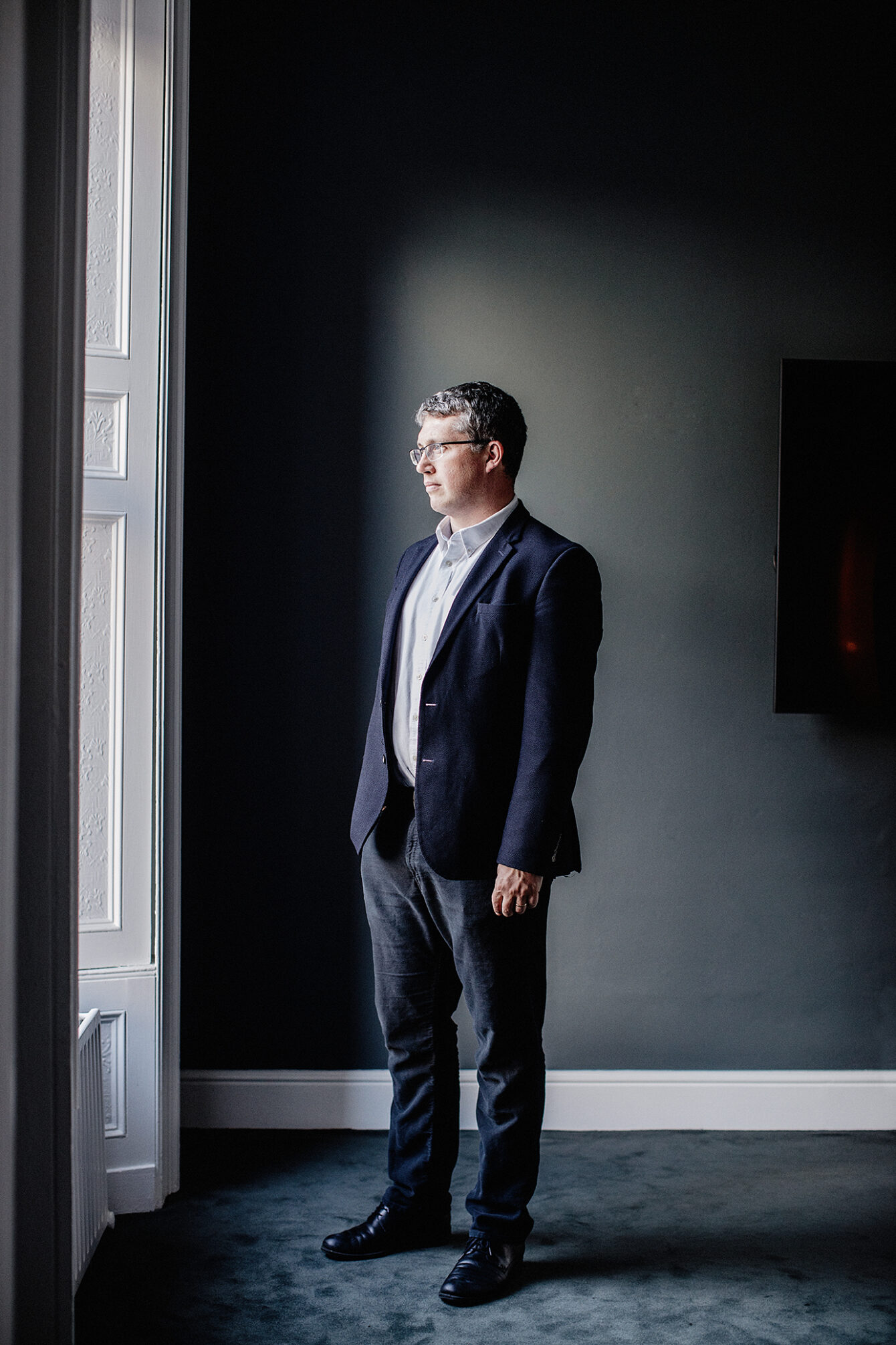
People friendly law firm
Corporate Services
The world's largest CTA investment manager
Corporate Services
Reputation innovation consultancy
Corporate Services
The Power of Full Circle
Corporate Services
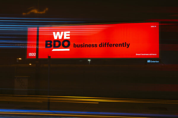
WE DO brand makeover
Corporate Services