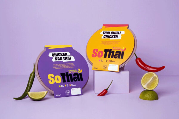
So Thai
So Fresh. So Tasty.
Food & Beverage
Food & Beverage
Food & Beverage
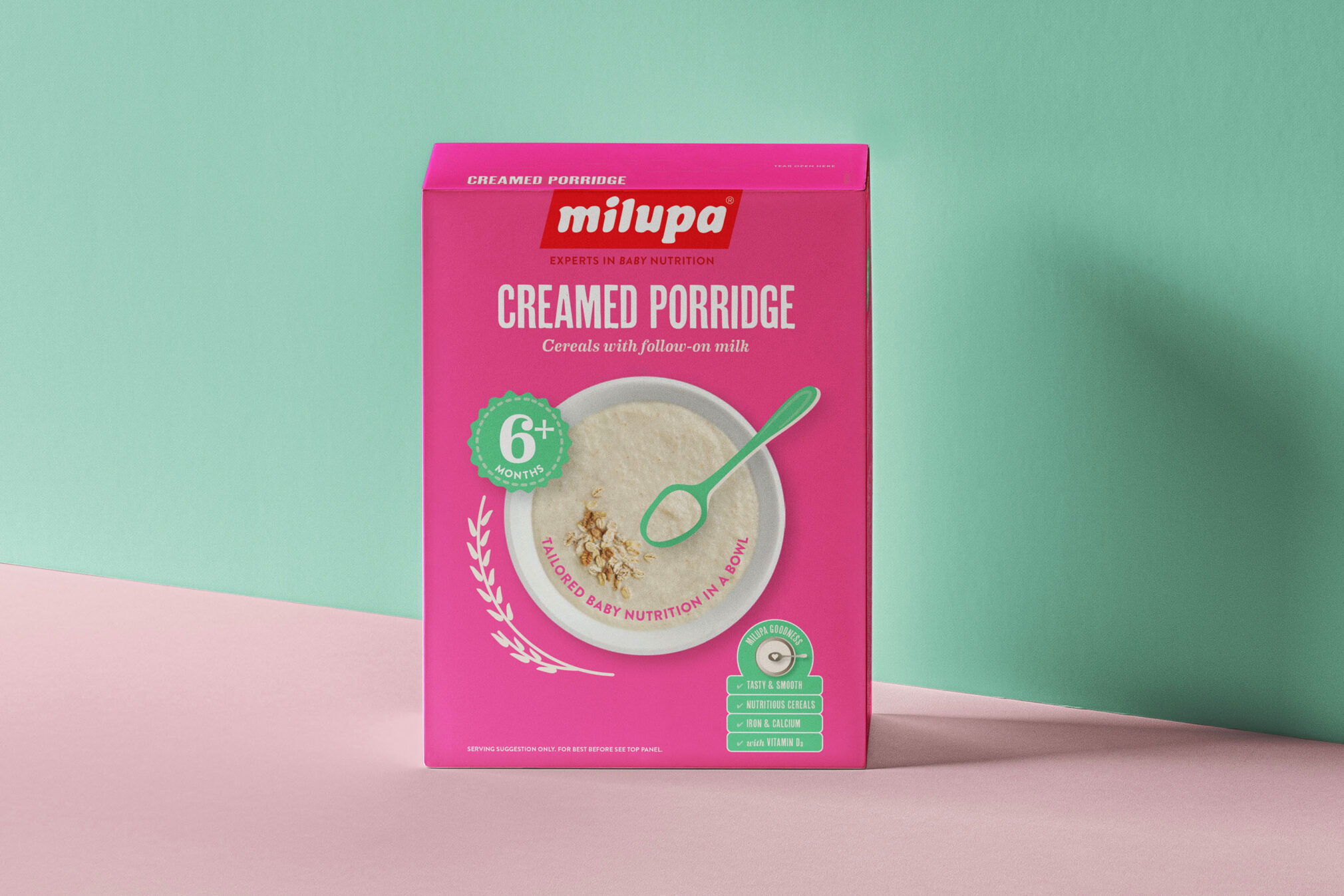
Danone commissioned CI Studio to help them overhaul their iconic Milupa range. The market for baby food products has exploded in recent years with new disruptors appearing on shelf. The challenge for us was helping Milupa set itself apart in this crowded category. A strategic review of the brand, alongside positioning work and competitor analysis, gave us the insights to came up with a redesign that worked more effectively.
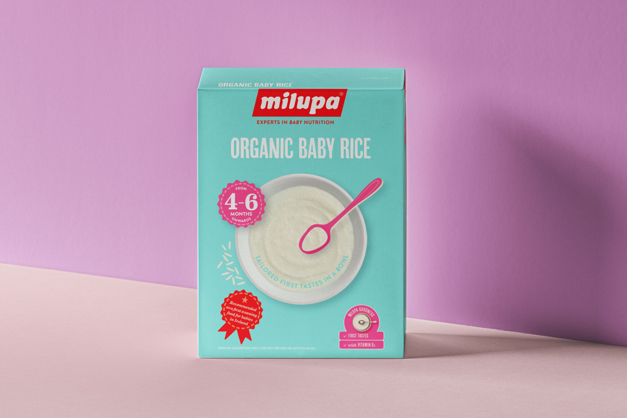
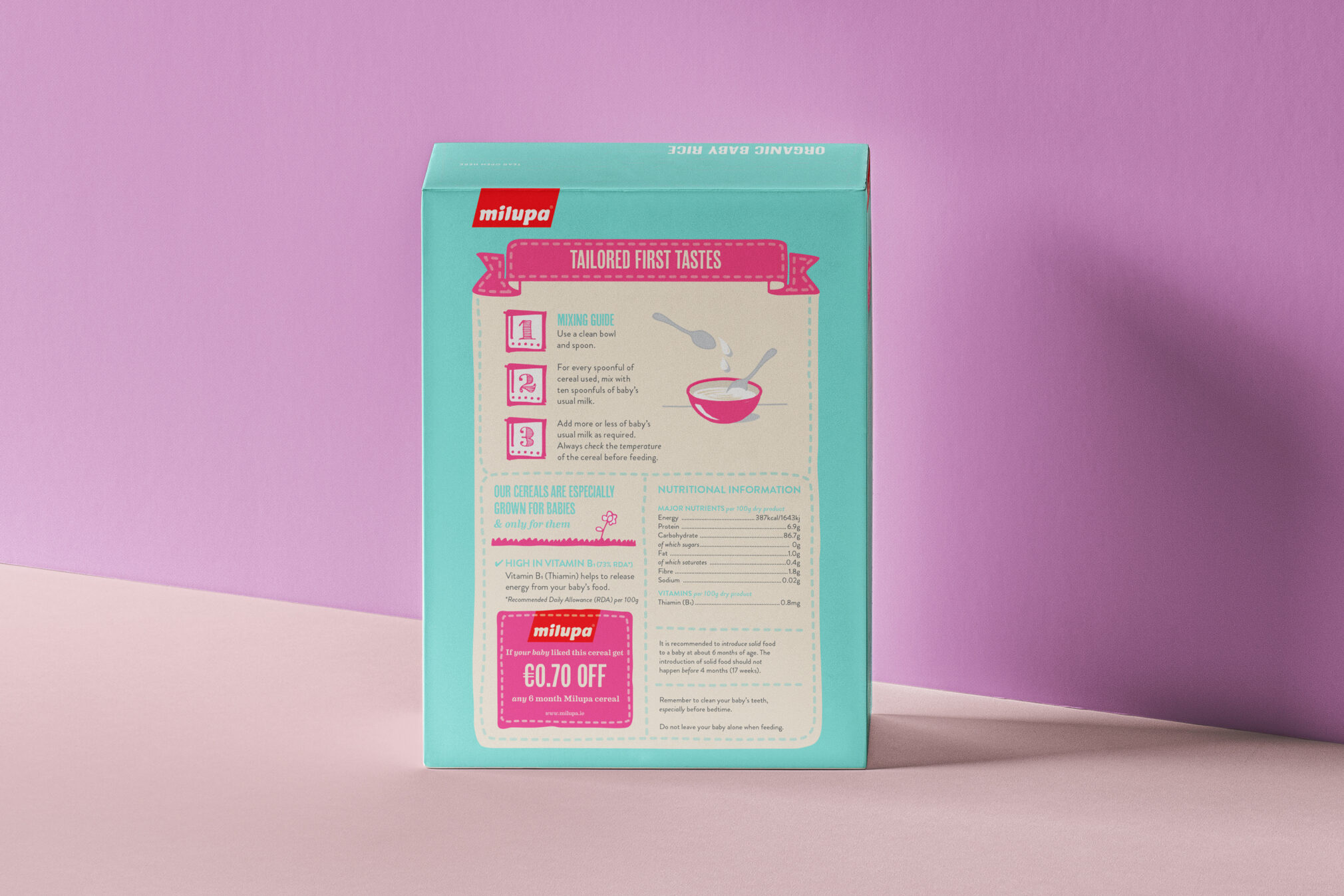
To create standout and take on a more contemporary feel, bright colours were introduced. This distinctive use of colour helps customers quickly identify flavours. The previous packaging suffered from visual clutter and a lack of differentiation across the range. The new front of pack design is simplified with ingredients clearly shown, making it easier for parents to know what's inside while clearly communicating the nutritional information that need to be accessed quickly, in a simple and understandable fashion.
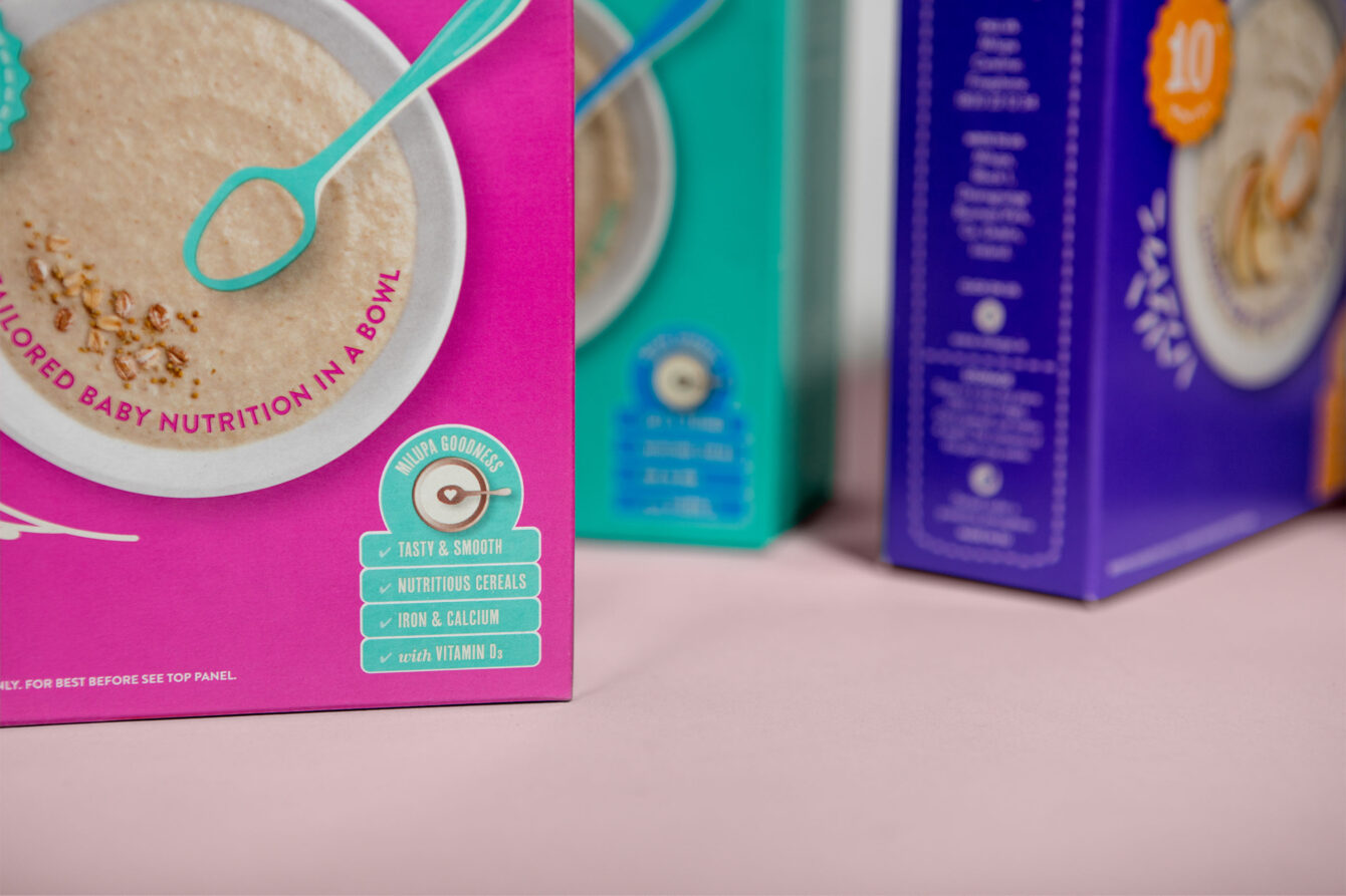
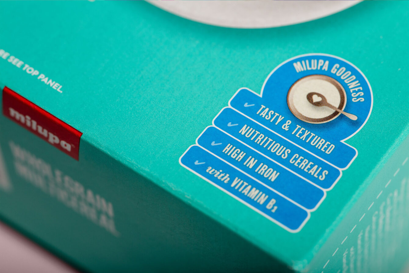
The redesign with its friendly typography, playful assets and focus on ingredients, was a huge success. It allowed Milupa regain their foothold in the baby food category. Over a decade later, it still looks fresh and continues to be relevant, allowing parents to quickly comprehend the nutritional benefits of choosing Milupa in busy store environments.
So Fresh. So Tasty.
Food & Beverage
Superior Irish Seafood
Food & Beverage
Healthy food from Unislim
Food & Beverage
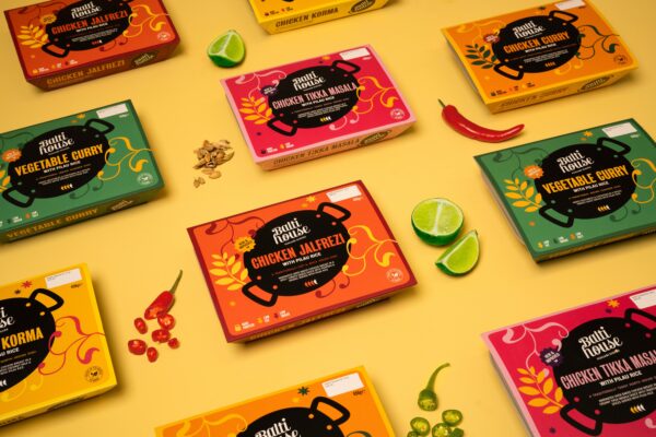
Authentic Punjabi Dishes
Food & Beverage
Taking fitness further
Food & Beverage
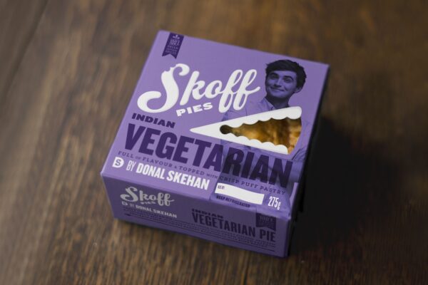
Pies of flavour from Donal Skehan
Food & Beverage + Retail