Prestige
Finest Irish paint reimagined
Retail

Retail
Retail
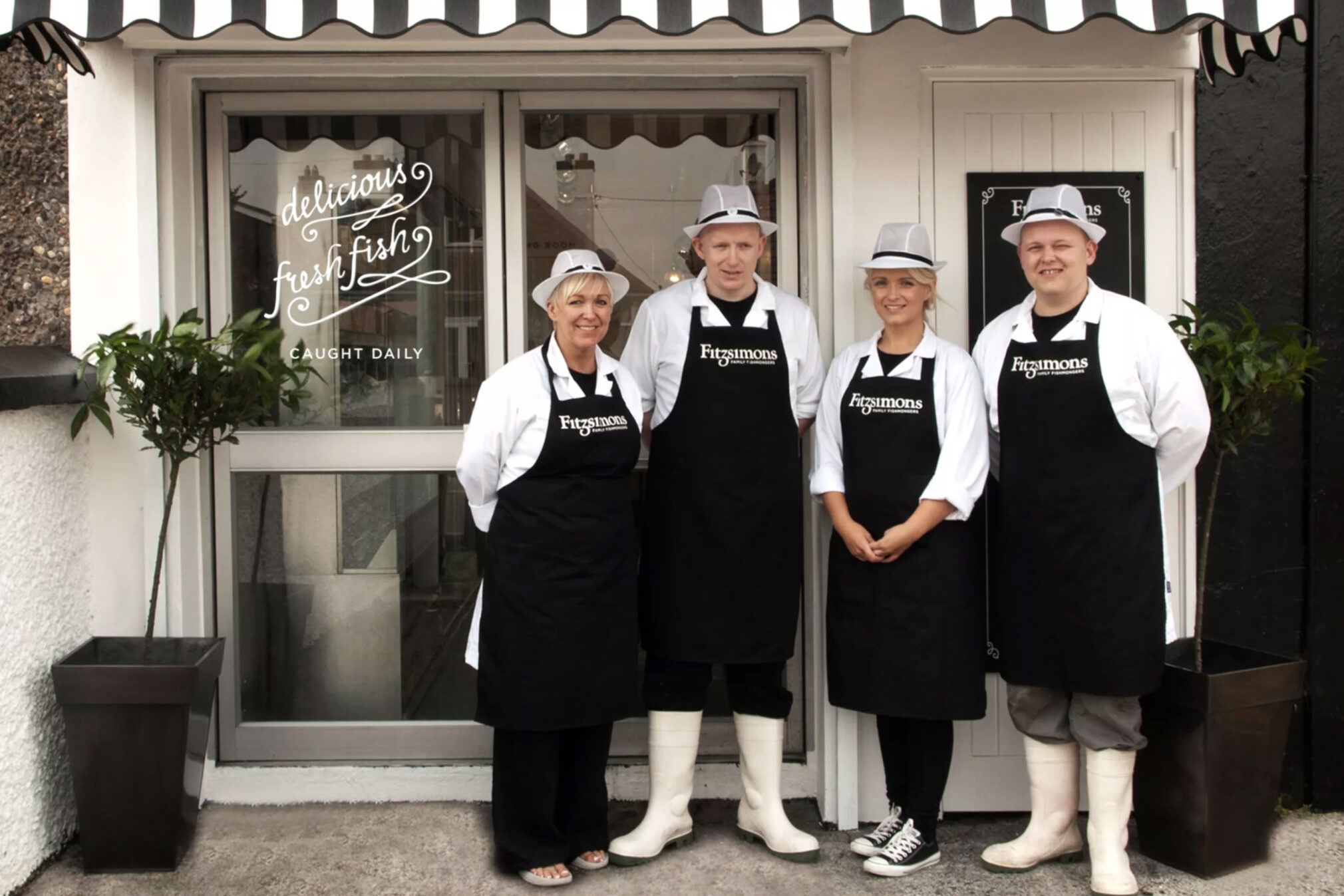
This small family fishmongers is located in the heart of Crumlin and needed help repositioning their business so they could appeal to a broader demographic. Starting with the name, we changed them from JL Fitzsimons to Fitzsimons Family Fishmongers, which enforced the family and artisan aspect of the business.
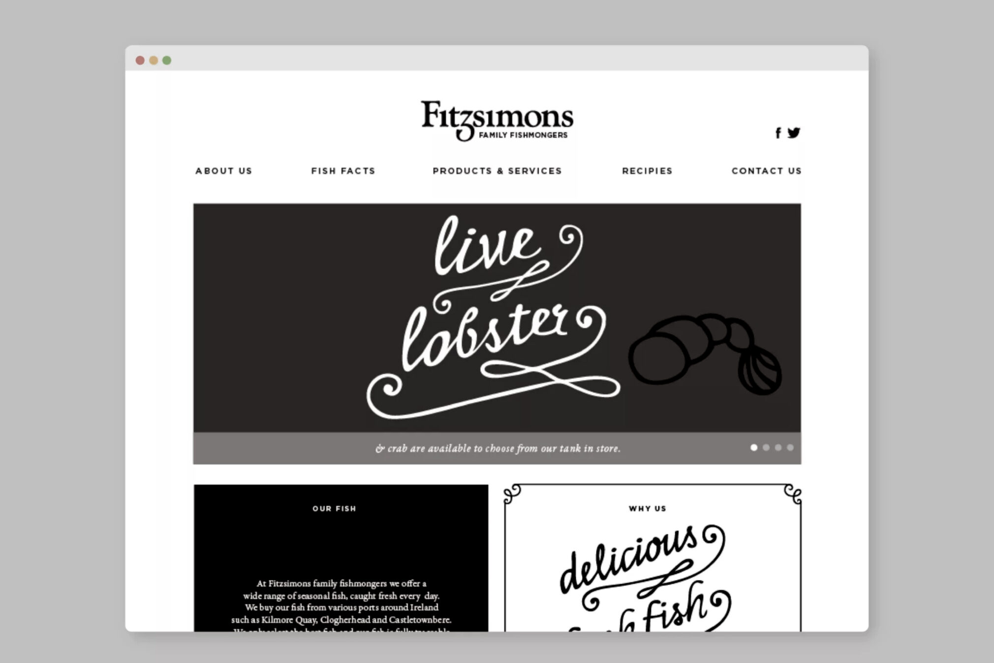
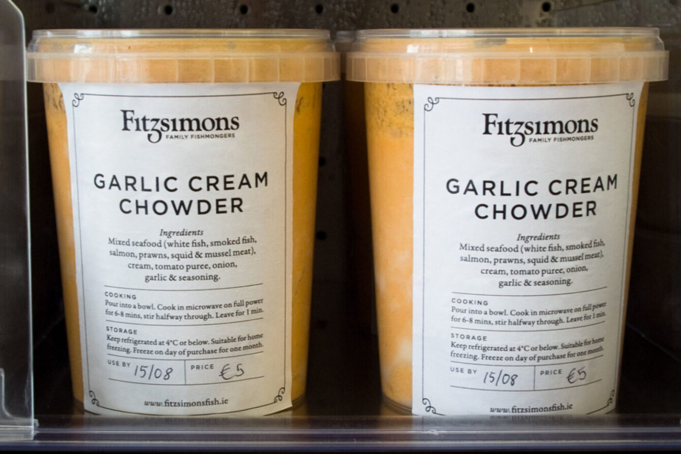
A traditional brand mark with a nod to a fish tail was created. This was paired with more contemporary typography and wry copy, to create a memorable and playful brand.
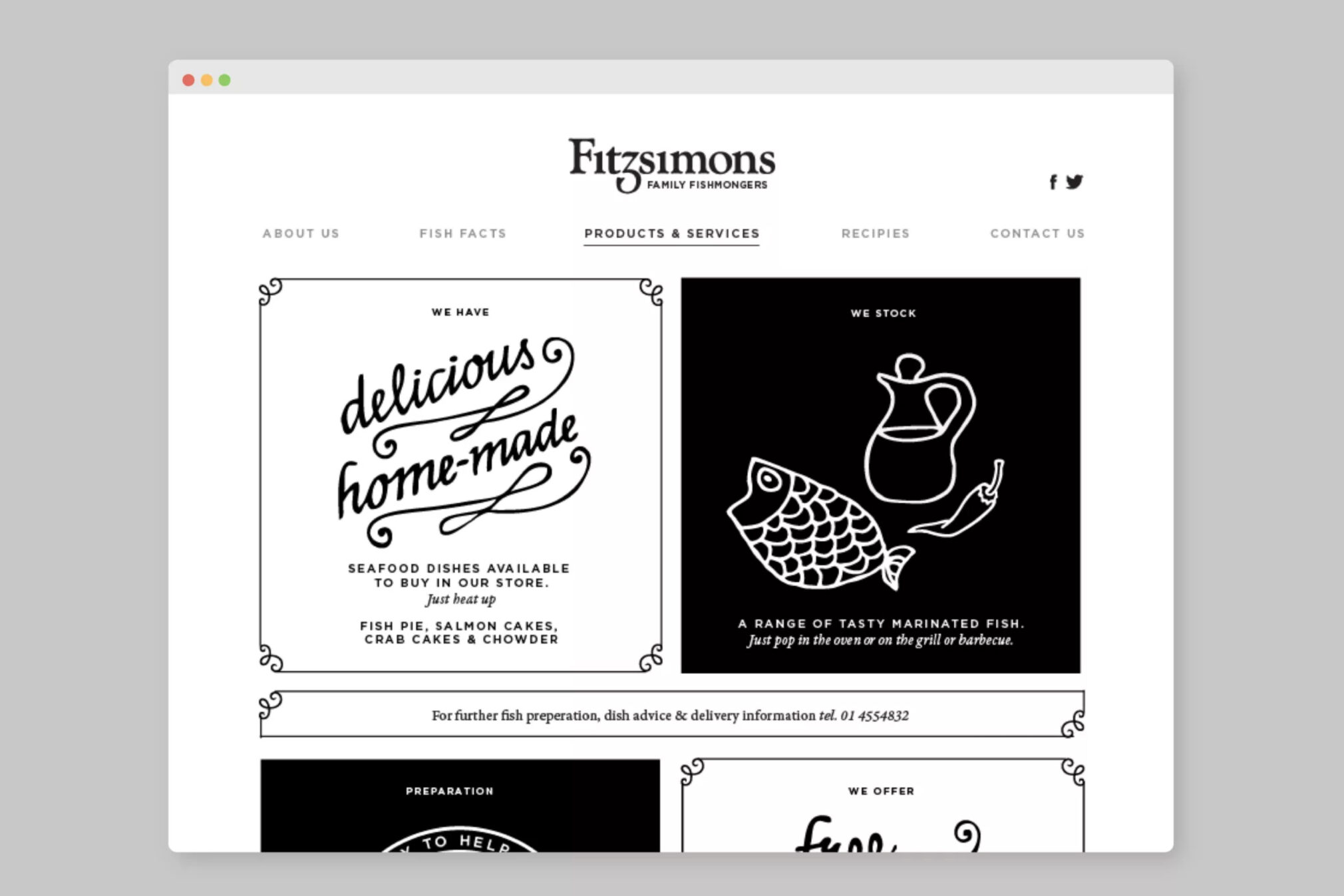
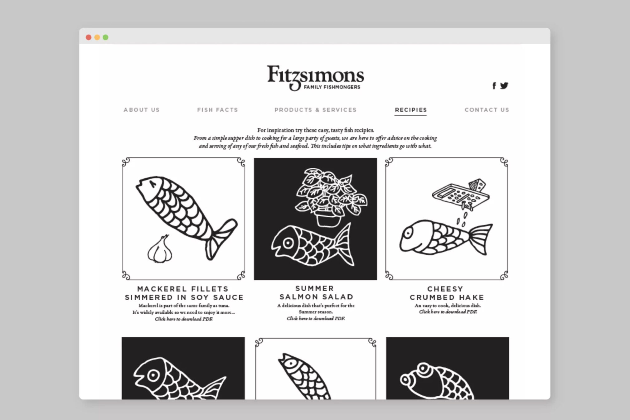
We chose a set of simple yet quirky fish illustrations which appeal to all age groups to give the brand an injection of charm and which work as a consistent element across all collateral.
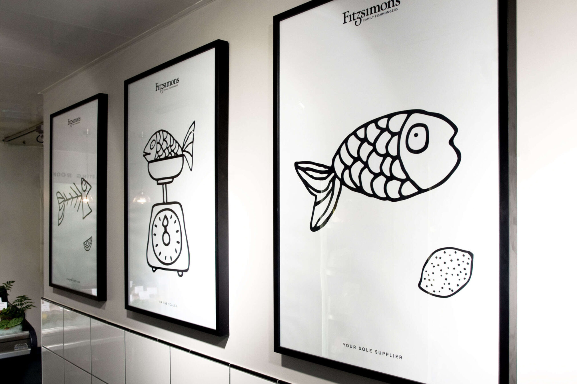
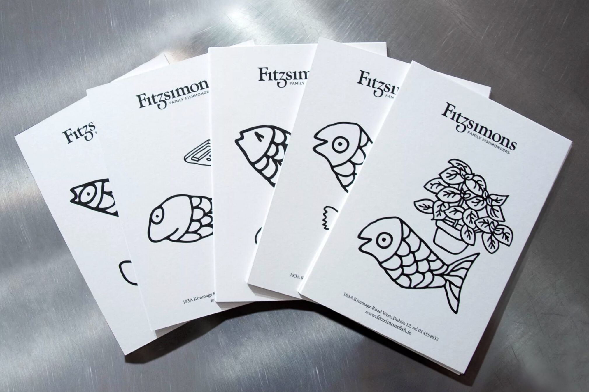
Using a simple black and white palette for impact, this also references the time old tradition, of wrapping fish in newsprint. This monochromatic scheme worked hard to deliver print items within a tight budget.
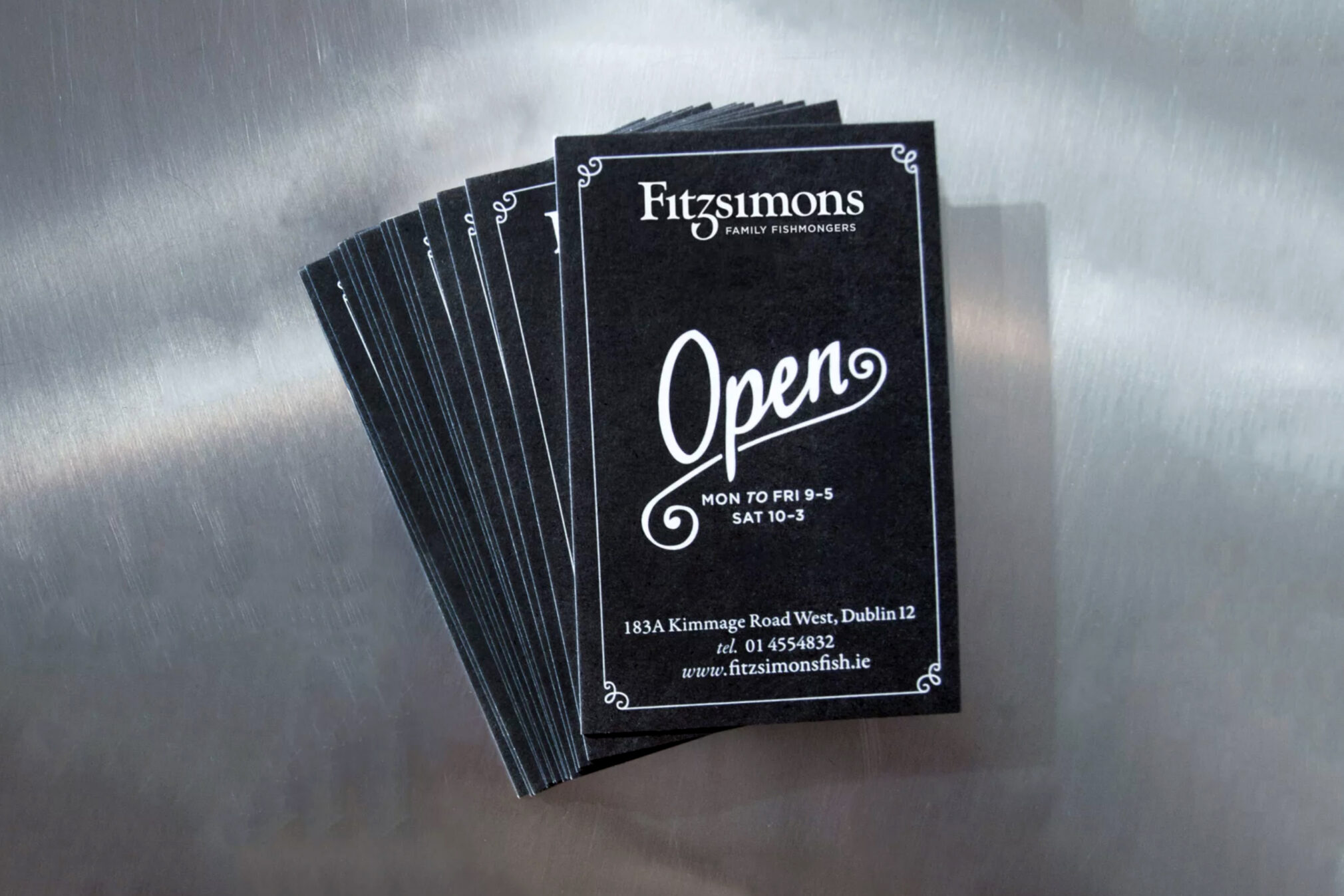
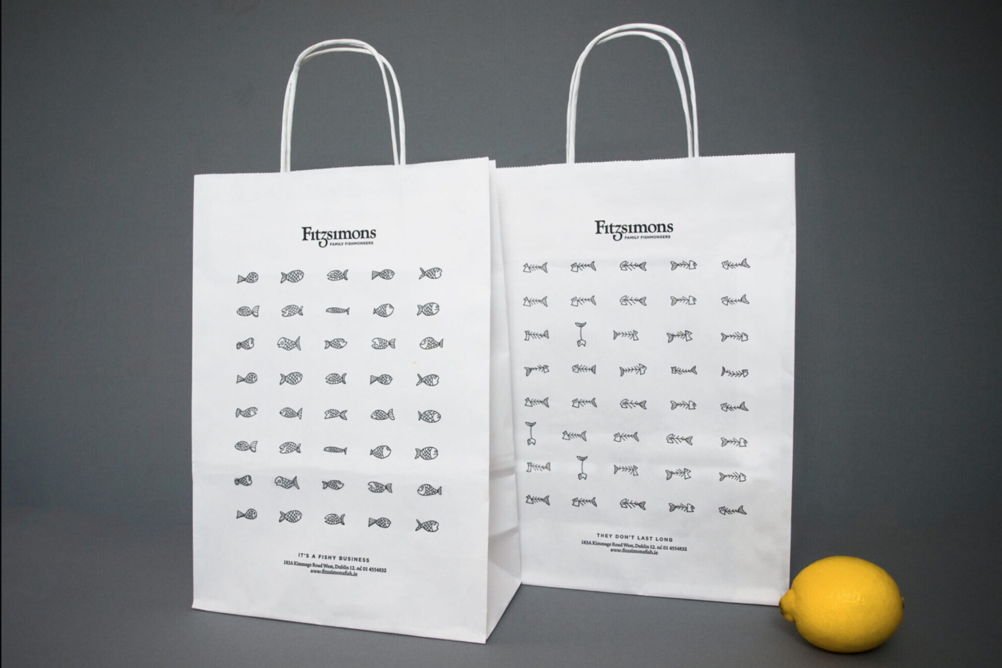
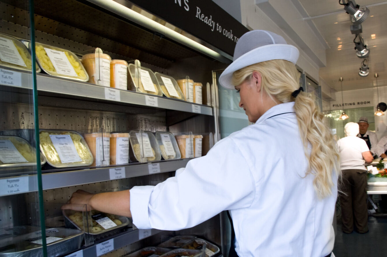
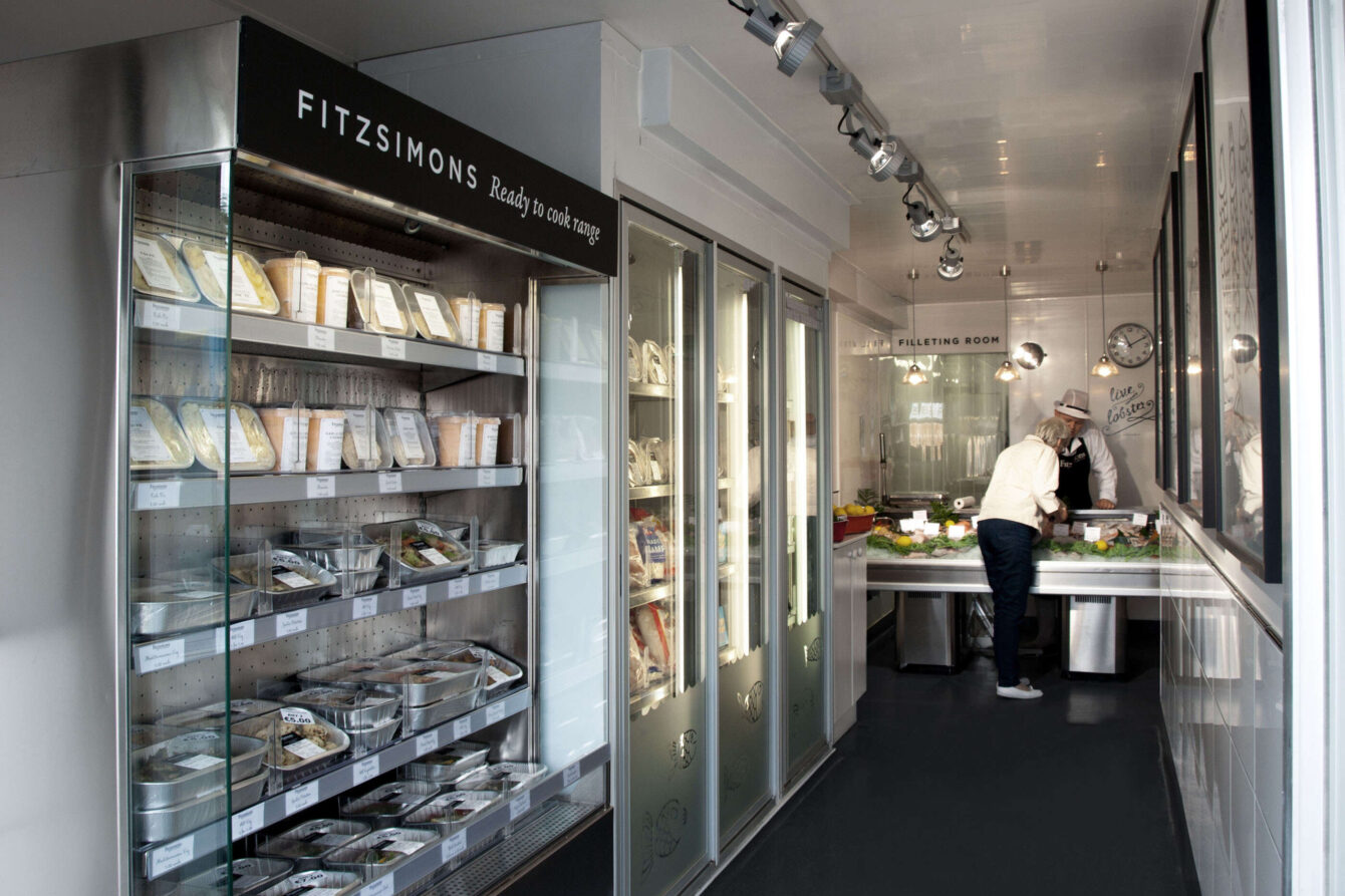
The result was the creation of brand, with a traditional, friendly yet sophisticated feel to appeal to new customers, yet not alienate the existing customer base. The brand was brought to life through a retrofit of the store exterior and interior, signage, environmental graphics, livery, promotional material, packaging and the website.
