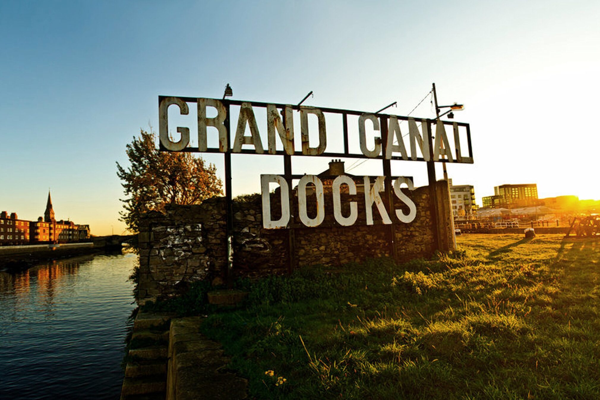
The logo took shape from looking at the typography in the area and in particular the iconic metal Grand Canal Docks sign. This industrial style embodies the area and is something we tapped into. Exploring condensed typefaces, we settled on one that had a distinct personality with the flared tail of the ‘R’. We wanted the logo to become as iconic as the building itself. We crafted a mark formed from a series of inlines, emphasising and pushing the concept of repeat and reflection.
Grand Canal Dock is undergoing a second renaissance. CI studio have developed a brand for the latest building to launch there.
“This play of light from both the glass and mesh on the building, along with the proximity of the building to the water, led us to the name The Reflector.”

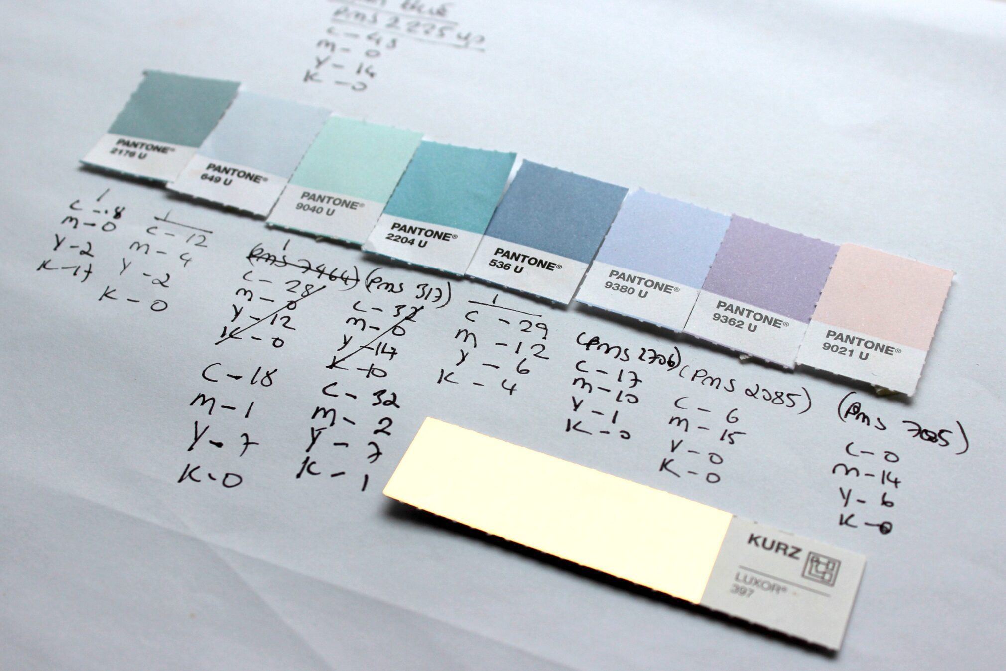
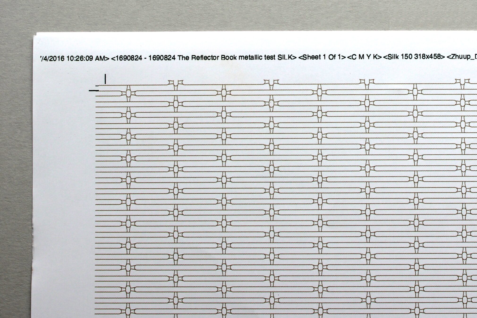
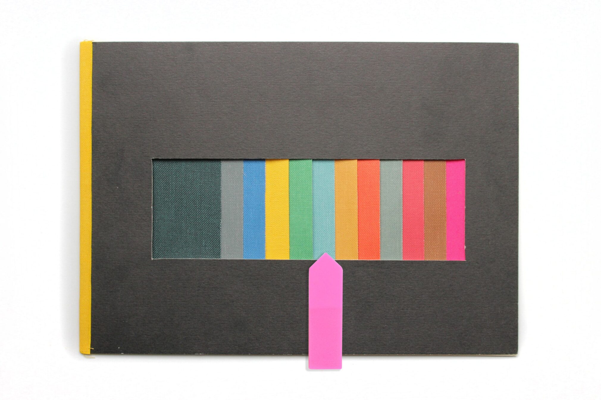
A pattern was developed for the brand, which was traced from the mesh panels. Colours began to form, drawing cues from tones which will scurry over the façade of the building – feathery blues, mossy greens, squally greys and dusty pinks all inspired by the unique vastness of water and sky. Bronze was chosen as an overarching colour, a direct tie back to the distinct façade.
A strong visual thread was needed to tie together the various assets of the brand, carried out by a diverse group of preferred partners. Imagery needed to exude the rich golden tones that would become synonymous with The Reflector. Work commenced on developing the CGIs, photography, video shoots and drone footage. Our brief dictated that all imagery was to have golden light, in other words magical early morning sunlight or softer, late evening dappled light. Needless to say, with the Irish summer that 2016 held, there was some patient waiting, but we got there in the end.
Our conference table full of books and brochures from various developments was similar to the infamous business card scene from American Psycho. Each one, bigger, bolder and better than the next. Creating something that would stand apart from the crowd was always important, as was designing a piece that people would want to touch, to open and be portable enough to put in their bag. To break the mould of the hardback tombstones we saw, we wanted to make a book that felt flexible and soft. We thought a cloth bound, soft cover would create this effect. The colour of the cloth was very important as we had been working with a specific blue, with green undertones. Not your standard off the shelf colour, that would have been too easy. We eventually found the colour we were looking for, tracking down a sample from an artist in London. They very kindly let us in on the secret of who their supplier was, which after a little confusion with colour swatches being renamed, led us to finally finding our colour.
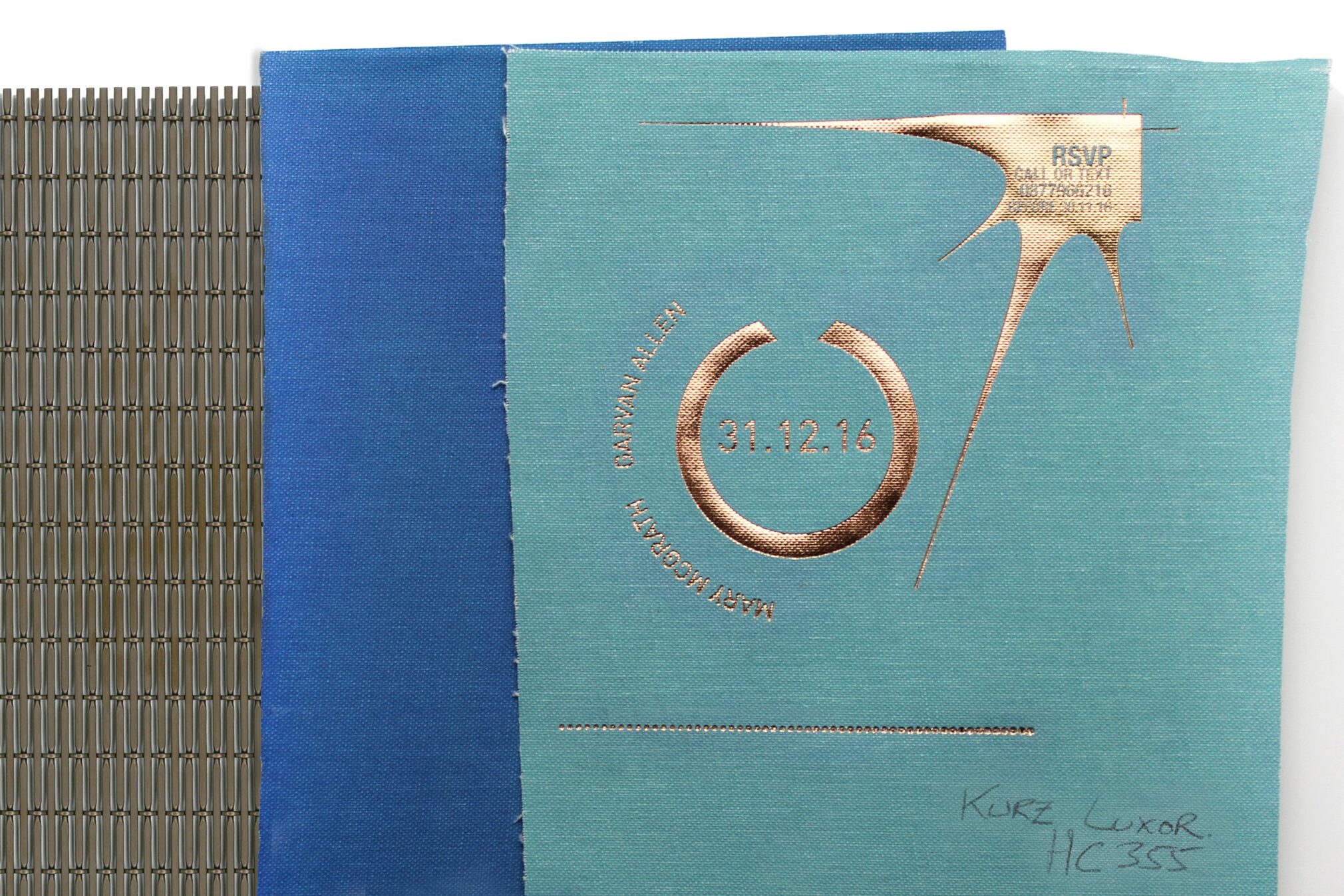
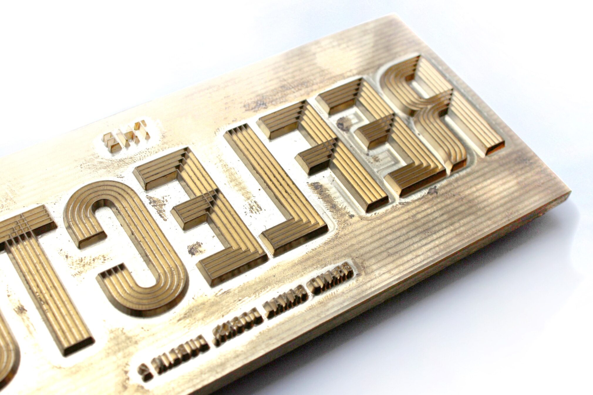
We wanted to foil the logo on the cloth, but before proposing this to the client, we had to test the idea. Every substrate behaves differently on different materials so would the foil actually stick, sometimes they don’t. Our foilers in Dublin arranged for a sample to be made and luckily it worked. Time to see how the client felt about it. They were as excited as we were, finally a move away from the monochromatic, hard bound books. Their one other request was for the book to open flat. We went to The Netherlands for this, as it is one of the last countries in Europe where finishers create this type of bind. With some prototypes made and after a bit of tweaking, our format was ready. A simplified version of the logo was crafted for the foiling process and the relatively manageable number of books, meant the amount of hand finishing required was plausible. The Dutch know how to make good books and they certainly lived up to their reputation this time.
The website needed to showcase the beautifully rendered CGIs. The intrinsic nature of the logo, meant it needed space and size. It was decided that the navigation should live at the bottom of the page, giving the brand some space and also allowing easier navigation on a smartphone, an important requirement from the selling agents. Added functionality of interactive floorplans allow for an easy understanding of the space. Photography from Dublin streets scenes convey a convivial city and complement the refined CGIs.
More is less was our philosophy for the hoarding. Luxe gloss white panels offer subtle reflections and work beautifully with the chrome gold decals used to form the oversized logo, which can be seen at a larger than life size and is visible from across the water. This is one example of where it is acceptable to have the logo bigger! All the elements came together to form a carefully considered brand, memorable in appearance, paired back in application, embracing different tones and textures which capture the original concept of a waterfront building with a constantly changing view.
Rachel Kerr, Design Director