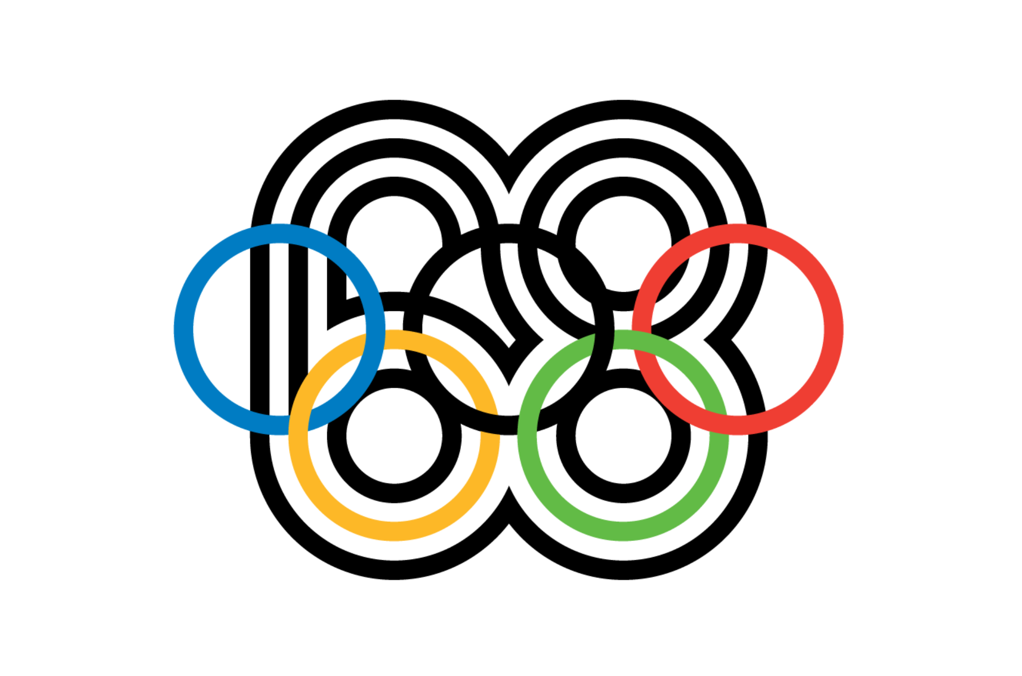
With Rio now well underway, we take a look at the Olympic identities and ask what the heck is going on?
When I first read the requirements of the brief given to the Brazilian design studio Tátil in relation to the Olympic logo I was slightly horrified. Trying to fulfil a brief that required you to “transmit Olympic values and attributes, to reflect the local culture, to project the city and country's image, to assure universal understanding as well as be current until the actual Games, along with many other considerations" sounded like trying to pull a rabbit out of a hat. But in fairness to Tátil they seemed to fulfill the brief. Multi-coloured figures hand in hand shaped in a three dimensional sculpture symbolising “togetherness in diversity”, green, yellow and blue colour scheme mimicking the Brazilian flag as well as shapes that evoke Rio’s most famous natural landmark, Pão d'Açúcar. Wow – box ticked!
Well before we go applauding anyone just yet, there is the issue of the seemingly mandatory brushstroke-effect that seems to be hanging around like a bad smell since Barcelona ’92. Sydney’s logo stands out like a sore thumb with its boomerangs and Opera House which looked like it was designed by Christy Brown experimenting on his right foot. Olympic logos have a history of being annoyingly condescending. They assume that people have neither the maturity or the intelligence to find meaning in something dignified and abstract. It’s almost paradoxical that the Olympics represents the pinnacle of human achievement yet it’s visual representation reflects almost the exact opposite.
“It's very simple: good design requires a good client.”
It strikes me that, in its current state, the Olympic identity is a doomed job. It's very simple: good design requires a good client. The problem is that Olympic committees tend to be risk-averse, micro-managing and aesthetically stunted, with a far lower sense of where the lowest common denominator is than does the public justice.
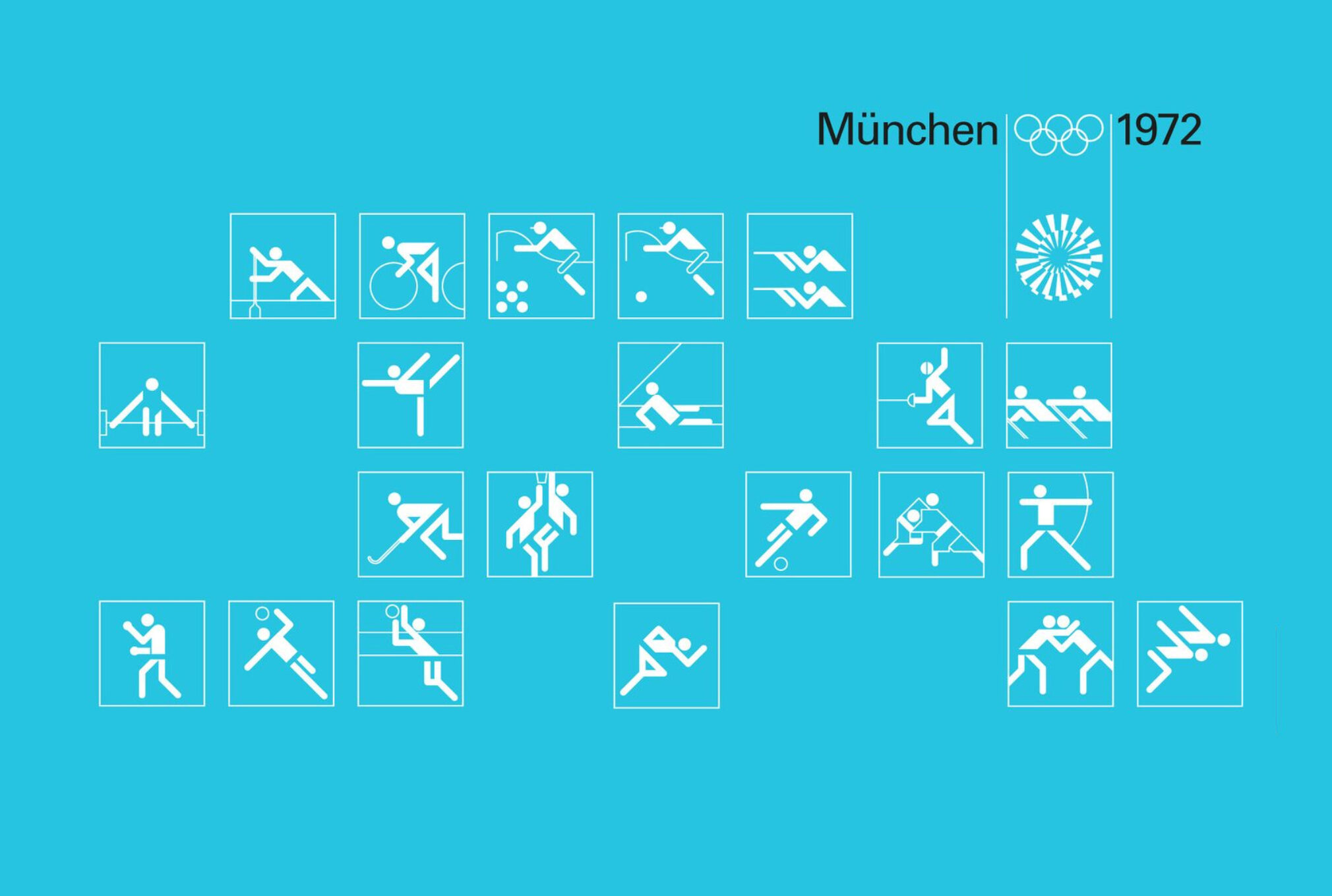
The cannon of Olympic branding must lie with Otl Aicher’s identity for the 1972 Munich Games. Bold, abstract and devoid of gimmicky representational nonsense. After all, why would the Games be cloaked in red, yellow and black when they represent every other colour in the spectrum? But much more important and memorable than the logo was Aicher's system of pictograms depicting the different sports. These were hugely influential, not just in subsequent Games but in sports centres all over the world. This is a case of how an Olympics can be a catalyst for meaningful design.
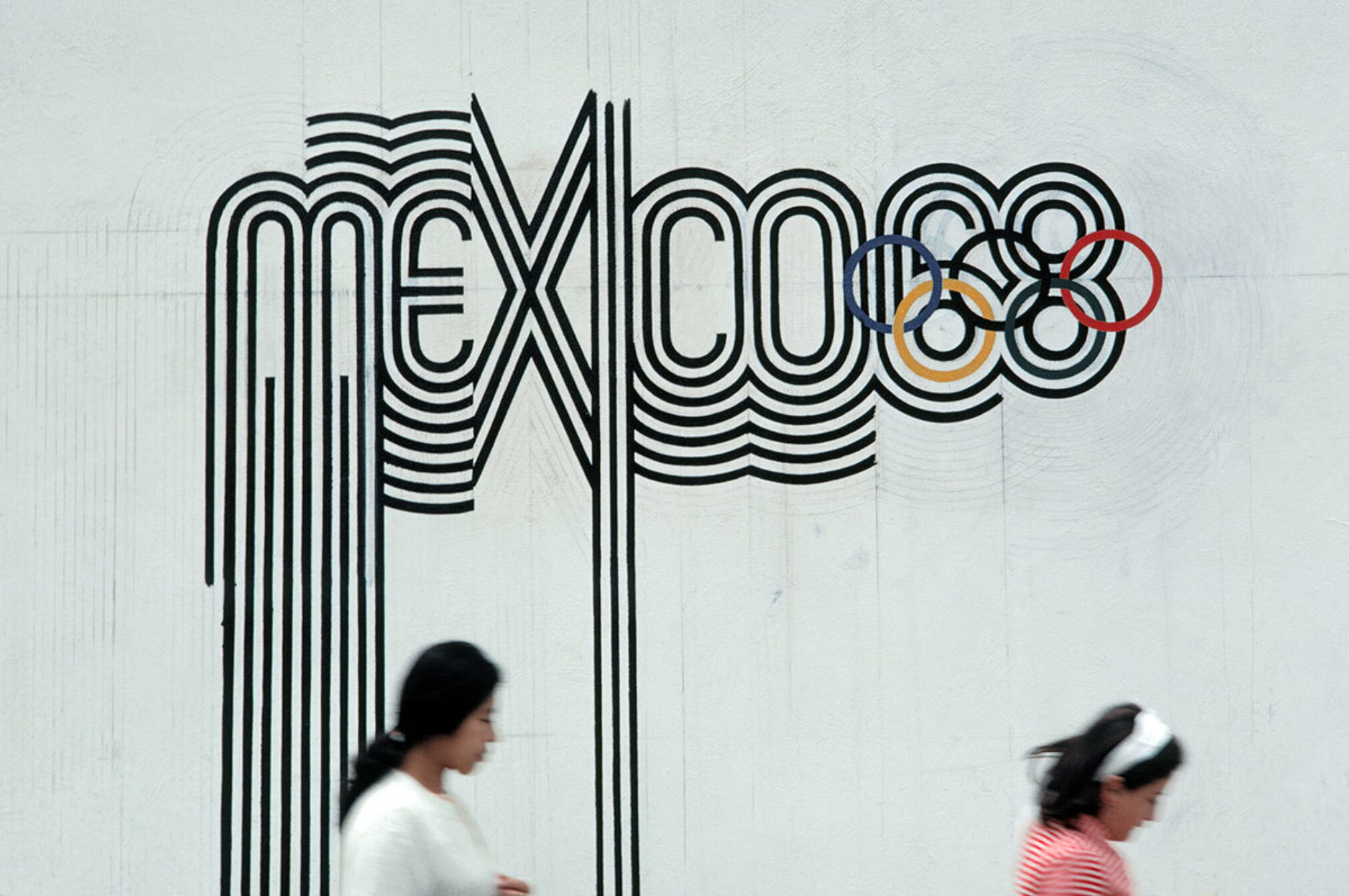
Even more inspiring was Lance Wyman's identity for the Mexico City Games in 1968: a bold and unapologetic op-art-inspired graphic. And it is in that striking vein that the good Olympic identities have followed. Ivan Chermayeff's logo for the Los Angeles Olympics in 1984, and in the same year, the red snowflake for Sarajevo's winter Games are great examples of successful identities that stand the test of time.
In more recent times the unveiling of the Tokyo 2020 identity feels like a throwback to logos from the 60’s and 70’s. There is a clear evolution from the 1964 Tokyo games logo and, rather than relying on the clichés of red and obvious Japanese iconography, they took references from traditional sources. The pattern within the logo is derived from a 17th century tribal fabric that comes from the Tokyo area. It’s mashing up tradition and modernity to create something iconic. Although the roll out is yet to be seen, there is something in this identity that feels like a step in the right direction.
If we are ever going to move away from the bland political correctness of Rio and Sydney and return to the visionary greatness of Mexico and Munich perhaps we need to put the politics aside and put faith in those who know best.
Philip Mitton, Senior Designer
This website uses cookies for analytics and an improved browsing experience. Click OK to accept.