Print is dead! Or is it? A look at the development of a stationery brand with traditional roots operating in a digital space.
“The task was set to create an iconic stationery brand of high-end affordable luxury that people will love and value.”
Coming up with a brand name is never easy, especially when you're looking for one that is not only distinct but needs to be trademarked and has an available dot com address. After a series of group meetings focused around name generation, we narrowed it down to two names. After digesting both for a few days along with further discussion with the client, we eventually decided on one – Monoset. It fitted perfectly: A personalised (mono) set of stationery. It also had the dot com available which was another huge plus.
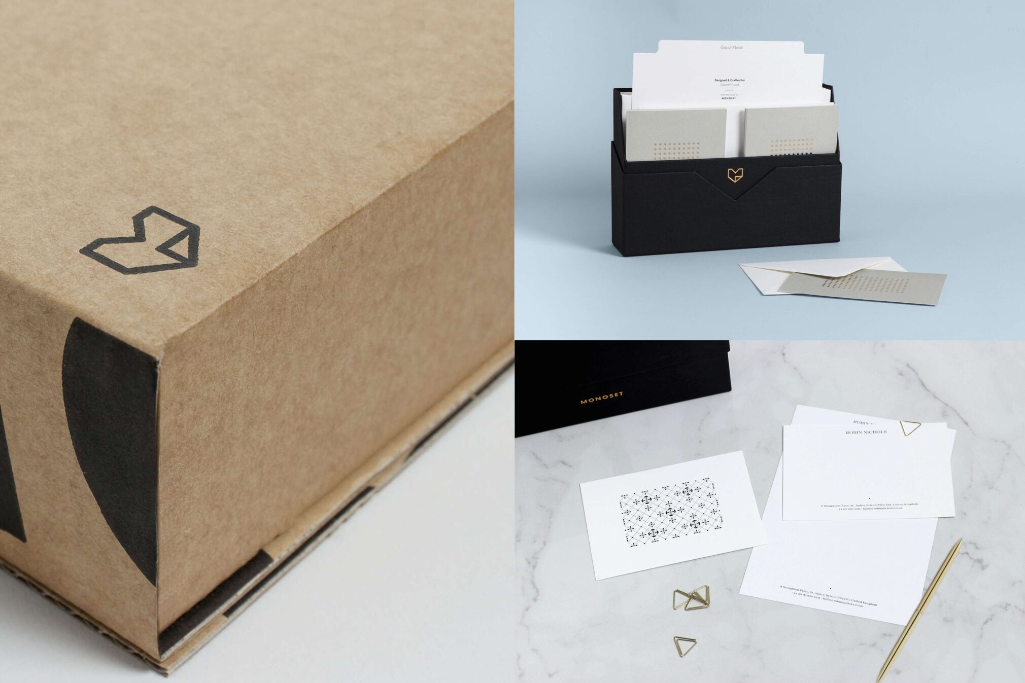
With the name finally decided upon, we set out to develop the brand mark. Days of quick testing with countless variations of the letter M led us to a symbol that reflected the love of paper and stationery. The mark was proportionally strong, aesthetically beautiful and gender neutral. It echoed all the right qualities that both ourselves and the client had previously outlined and fitted perfectly with our vision for the brand. Bingo!
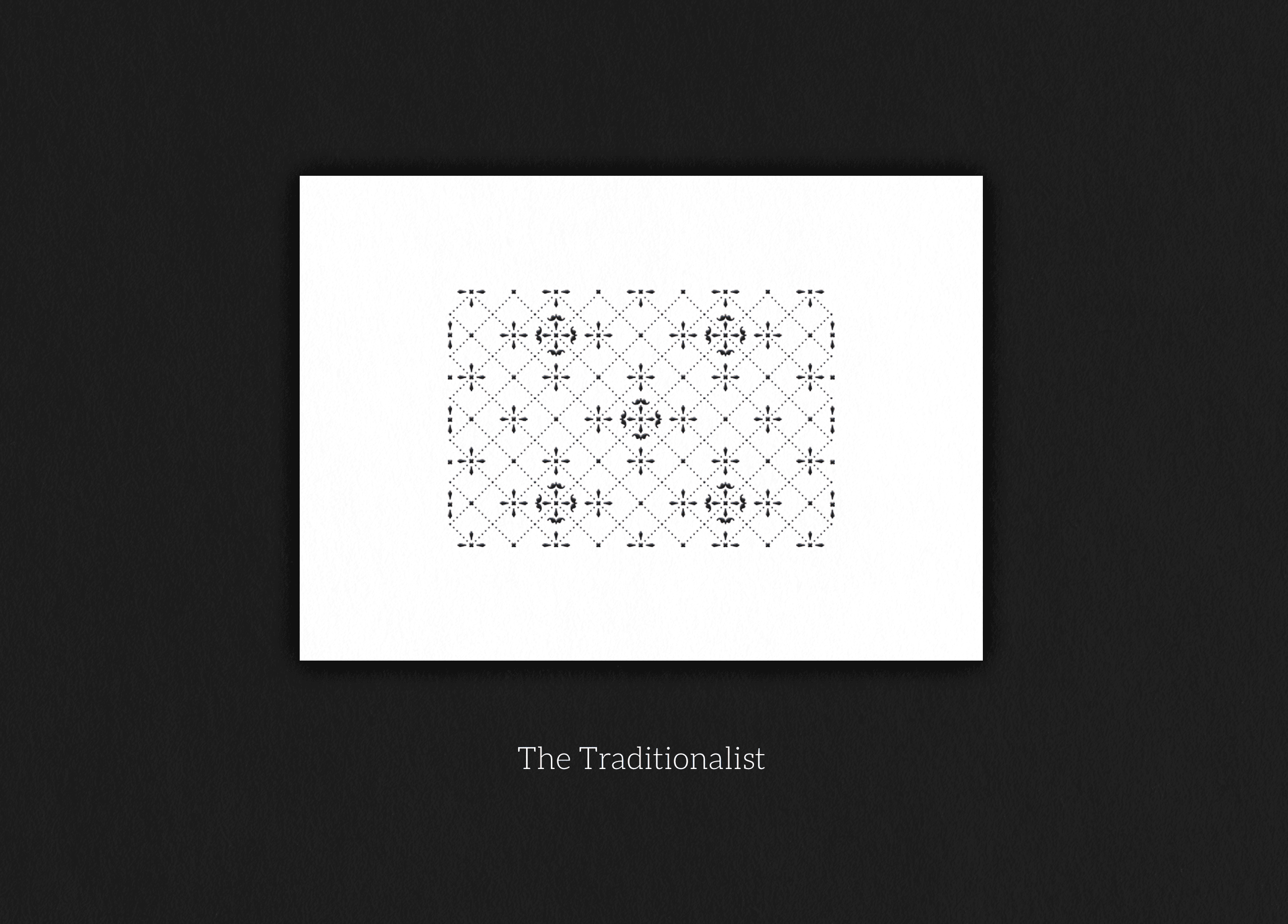
Development began on the printed items. By identifying the core audience, we built the product range around the audience segments creating the Monoset Collection to suit each segment’s personality.
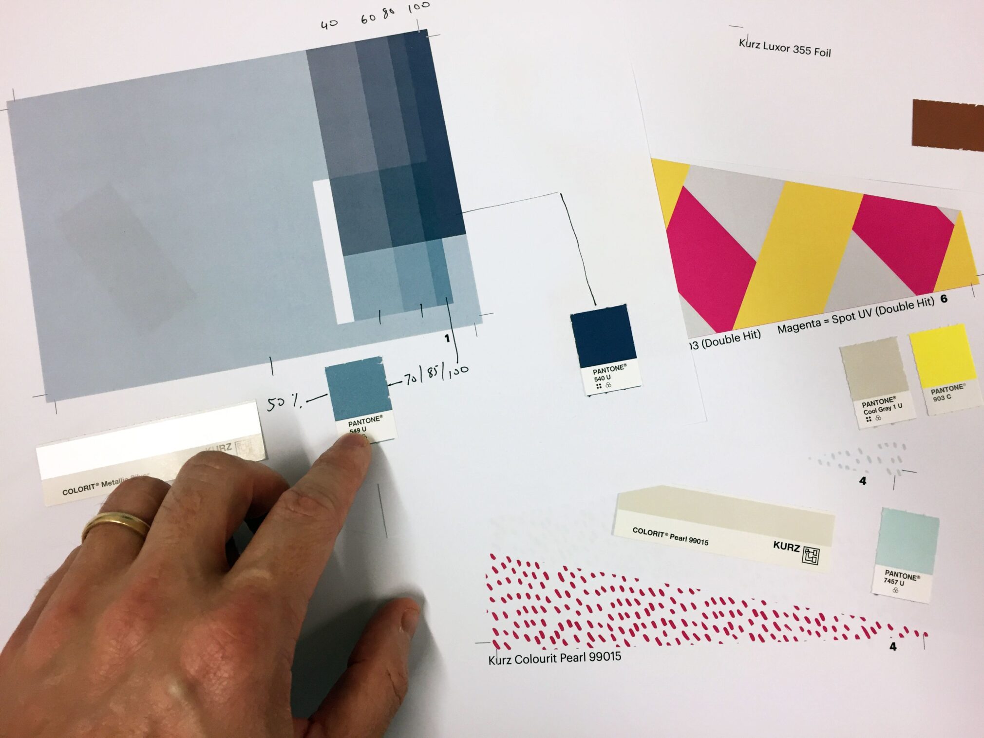
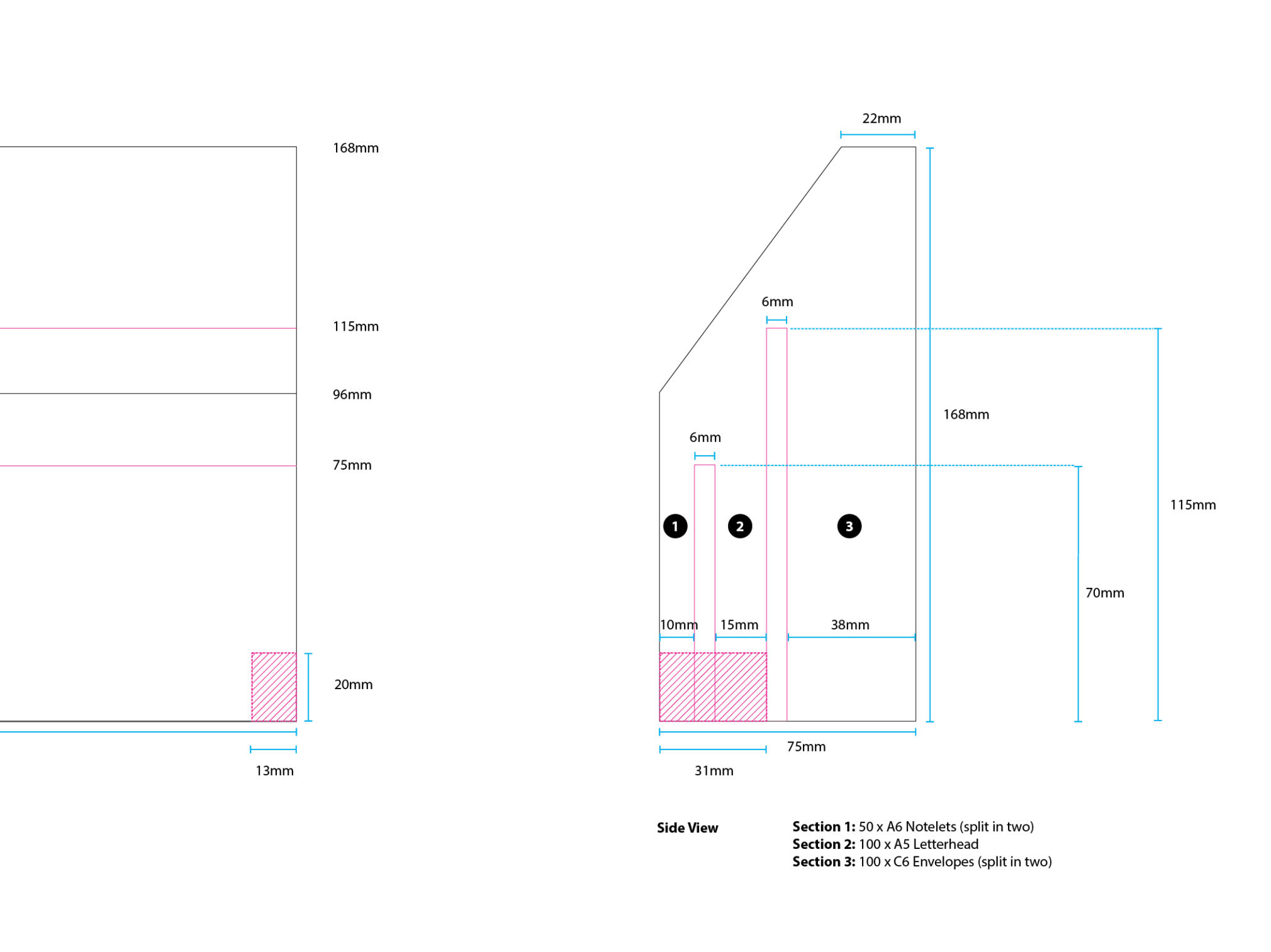
Alongside developing the visual identity, we also started sketching the physical elements of the product, namely the box and its contents. With the user experience firmly at the fore, we mapped out a customer experience from start to finish. How does it open? What do you see first? Are the sections sufficiently divided? What happens to the lid when it’s taken off? We mapped out every possible pitfall and corrected it until we arrived at a point where everything was functioning seamlessly.
All through the project the client had very high expectations for each component. We discussed the unique experience you get when you buy and unwrap a high end product (such as an iPhone). That feeling became our measure. That level of quality became our goal. Our competitors had gotten lazy, they had neglected this vital component and we saw this as yet another opportunity to capitalise.
Prototypes we made, revised and remade again and again until we were finally happy that we had reached a place that felt sufficiently appropriate for the brand.
The success of this project can be put down as a combination of many individual components but none more than the client themselves. Although there were learnings along the way for both parties, their understanding and respect for the design process along with their unrelenting drive and focus to get the project realised without any compromise made them a pleasure to work with. It just goes to show that when you have everyone working in sync, you can really get something special at the end.
We are also delighted to announce that this project has been awarded the prestigious Red Dot award for best product design.
Philip Mitton, Senior Designer
This website uses cookies for analytics and an improved browsing experience. Click OK to accept.