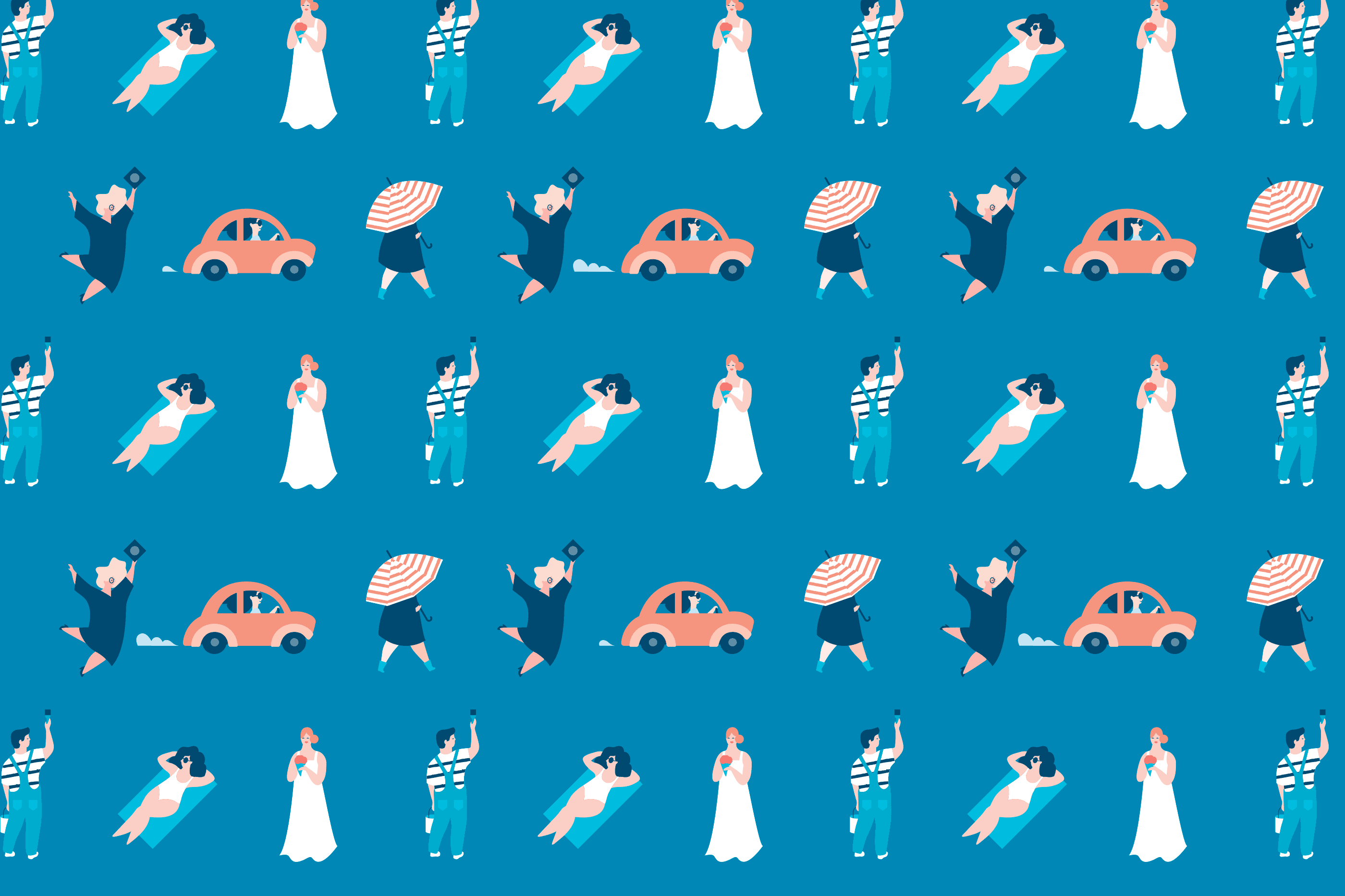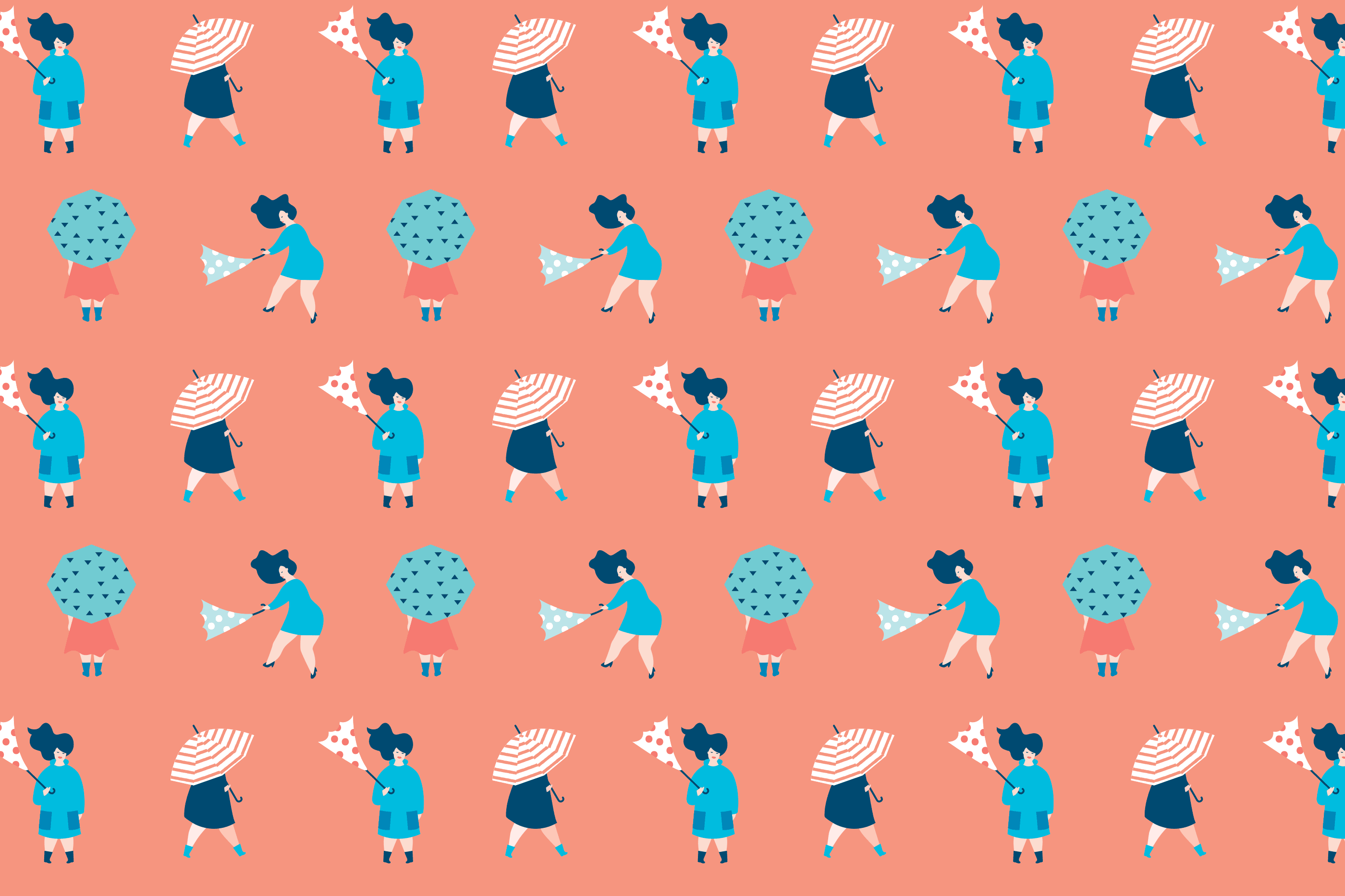
The illustrations, created in studio, feature unique characters inspired by people in everyday life situations, allowing anyone to identify with and to reinforce that sense of community. The overall style is quite minimal and whimsical with that sort of 80’s bold and brash vibe introducing a touch of tongue-in-cheek charm. This range of characters works cohesively, bringing together the services offered by Credit Union, creating an impression of friendliness and a more accessible tone to a serious context.
The wide colour palette is composed of shades of blue to complement the bright primary blue adding vibrant tones of red and orange to enhance that warm feeling.